![]() Trace Baseball
Trace Baseball
 Trace Baseball
Using the power of AI to help parents create great video of their kids
Product Designer
Youth sports
Full-time role
In brief
An existing video processing product was too complicated to use and provided low fidelity video. We conducted serious user research with parents, coaches, and players, digging deep into their needs and frustrations. We isolated a small set of key features and created a brand new app for the iOS app store. Through iterative usability testing, we fine-tuned user interactions. Finally, we launched an app on the iOS app store.
Challenge
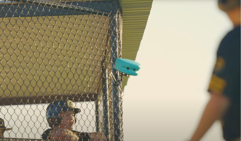
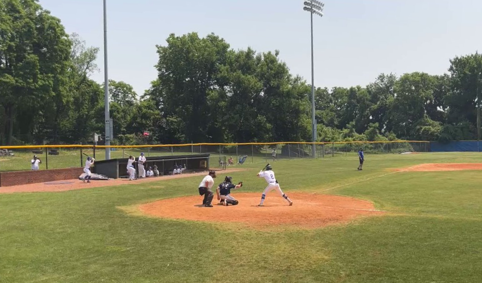
The Trace Cam, our existing video capture device, falls short in capturing high-quality video of baseball games due to its distance from the diamond. While this approach works well for the families and coaches of soccer players, the shape of the baseball diamond means that the camera is often far away from where plays happen. This limitation results in subpar footage. We found that parents get little value out of the Trace cam product, and often choose not to resubscribe after their subscriptions end.
Insights
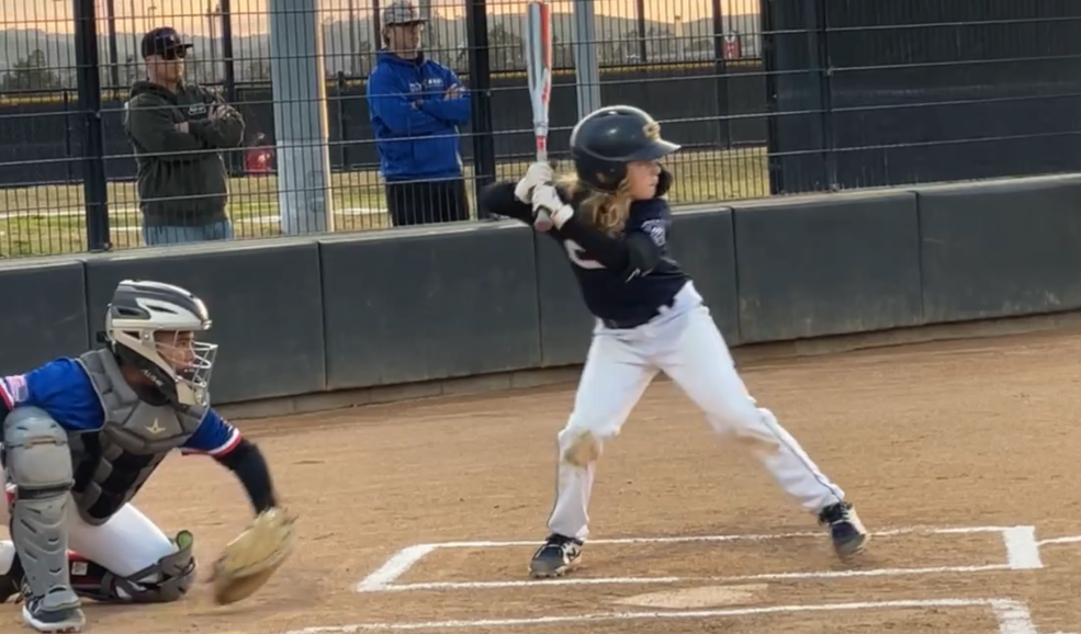
Through user research, we discovered that parents have a strong preference for recording video on their phones during baseball games. They find it more convenient and accessible, allowing them to capture the action from much closer vantage points. Additionally, parents already have a well-established culture of recording and sharing video on their phones, making it a natural fit for their needs. We find this is true both for groups that are already using the existing Trace Cam product, and those that are not.

Solution
To address these insights, we propose a shift in our approach. Instead of relying solely on the Trace cam, we can empower parents to capture their own video footage using their smartphones. By developing a stand-alone mobile app, we can provide a user-friendly solution that enables parents to record, automatically edit, and share high-quality video right from their phones. This approach leverages the existing behavior and preferences of parents, enhancing their overall game video experience and fostering greater engagement with our platform.
Personas
Understanding our users
Our team embarked on an extensive research process to gain deep insights into our users' needs, frustrations, motivations, and goals. Synthesizing hundreds of user interviews with users of the old baseball product was at the core of this research effort. Throughout these interviews, we actively listened to the feedback and experiences of our diverse user base, which comprised parents, coaches, and players, to understand their pain points and desires better. This process allowed us to distill the vast amount of data into three comprehensive user personas that represented our primary user segments: Rosa Alcantar, Mark Donin, and Isaiah Torres.
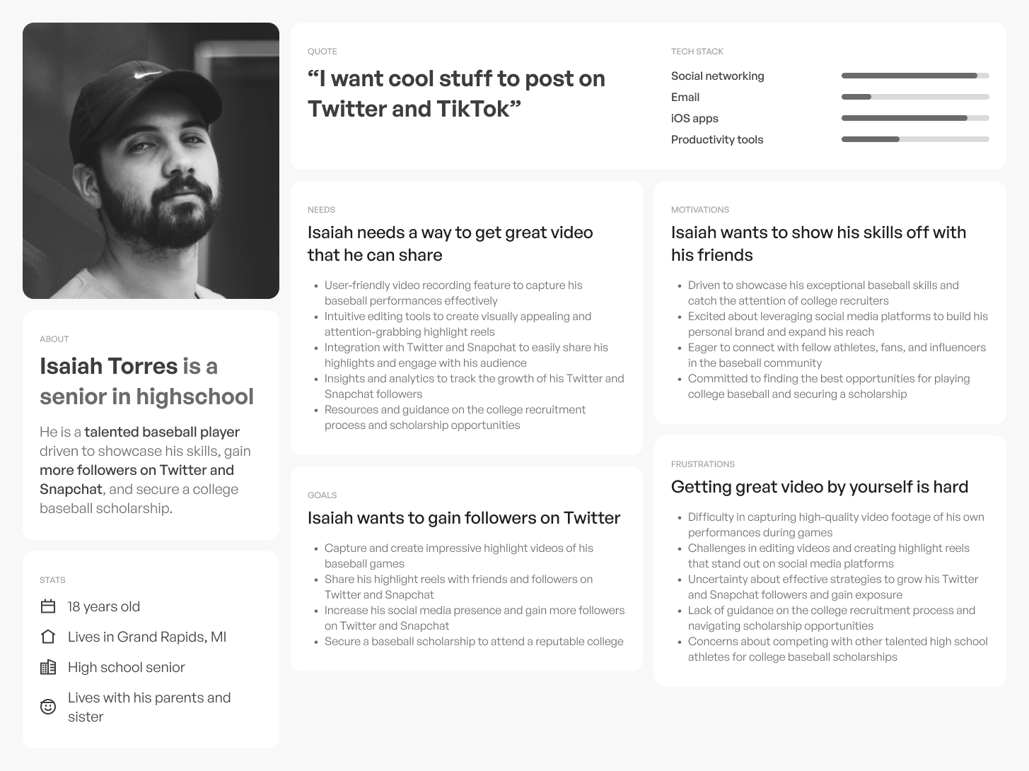
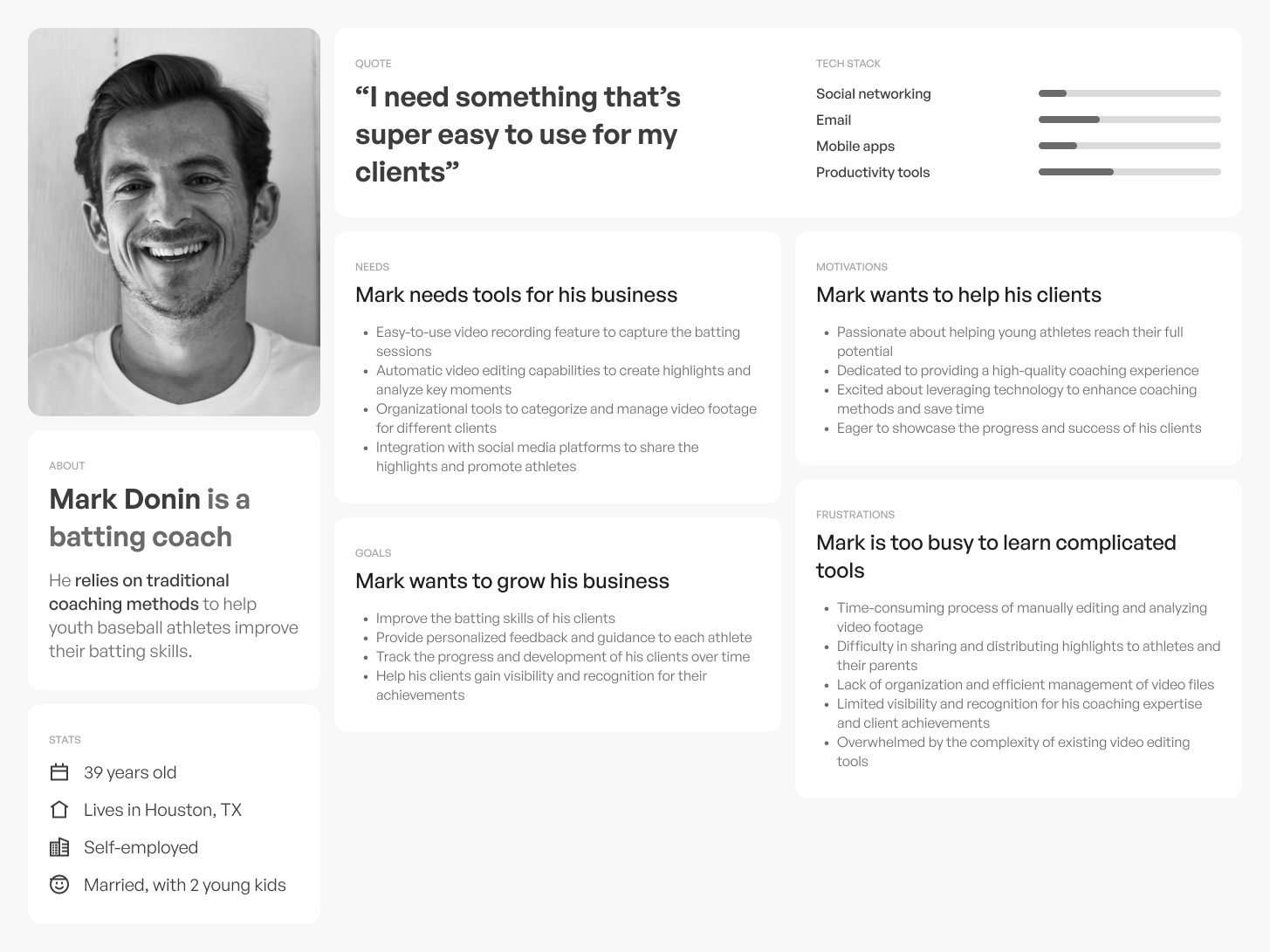
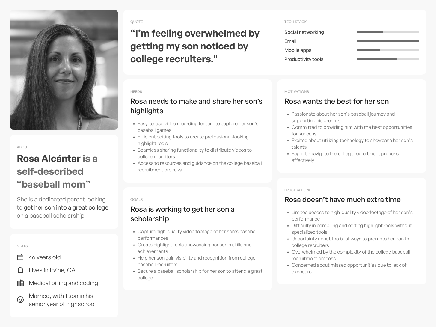
By synthesizing these extensive user interviews into these three user personas, we ensured that the design and development of Trace Baseball would be deeply rooted in the needs of our actual users. The personas provided clear insights into our users' distinct needs and aspirations, guiding us to tailor the app's features, functionalities, and overall user experience to meet their expectations and goals.
Key insights from Design Reseach:
- We need to design an app that will have 3 major features: record highlights, watch highlights, and share highlights
- We need some way for family members of players to get highlights of their kids
- We need some way for coaches to get highlights to the players and family members on their teams.
Minimuim Viable Product
Establishing core product features
The selection of key features for our minium viable product was driven by a deep understanding of our users' needs and the goals of our product.
We prioritized the ability to watch highlights as it provides a quick and convenient way for users to review and relive the most exciting moments of a baseball game.
Additionally, we recognized the importance of empowering users to effortlessly record videos and automatically generate highlights. This feature not only saves time and effort but also ensures that users capture and preserve the most impactful moments of the game.
Sharing highlights was another essential feature, as it enables users to engage with their friends, family, and fellow team members, fostering a sense of community and excitement around the game.
Finally, the ability to create and manage teams to automatically share highlights based on detected jersey numbers streamlines the process for coaches, parents, and players, making it easier to distribute and access relevant content. By focusing on these key features, we aim to deliver a seamless and enjoyable experience that enhances the way users engage with baseball game highlights.
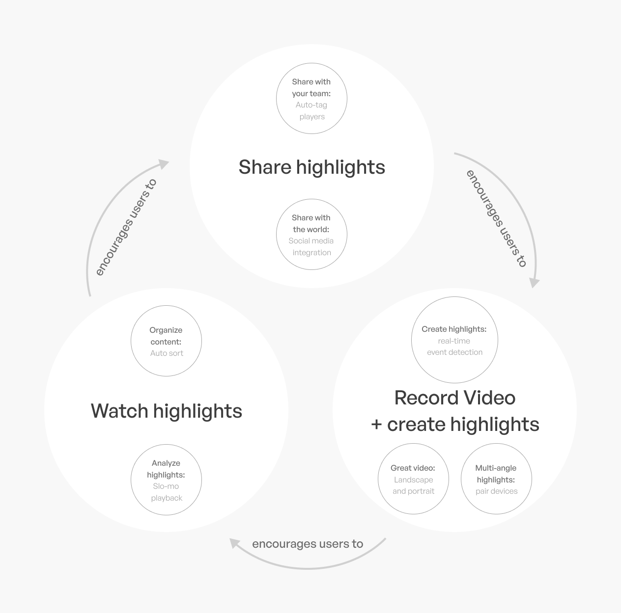 Product flywheel
Following players
Both parents and coaches needed to get highlights of players, but we determined that they would need to do so in different ways.
To address this, we devised a follower/following logic within the app to cater to the specific requirements of both user groups. This logic allowed parents to follow their kids' profiles, while coaches could follow their team's profiles. By implementing this feature, parents could receive updates and highlights of their own child's performances, ensuring they could capture and cherish those special moments without having to sift through a broader feed of every player on the team.
On the other hand, coaches could stay up-to-date with every player's highlights on their team by following the team profile. This functionality enabled them to monitor and assess each player's progress and performance. Additionally, the system allowed coaches to have access to all the highlights without compromising the privacy of individual athletes.
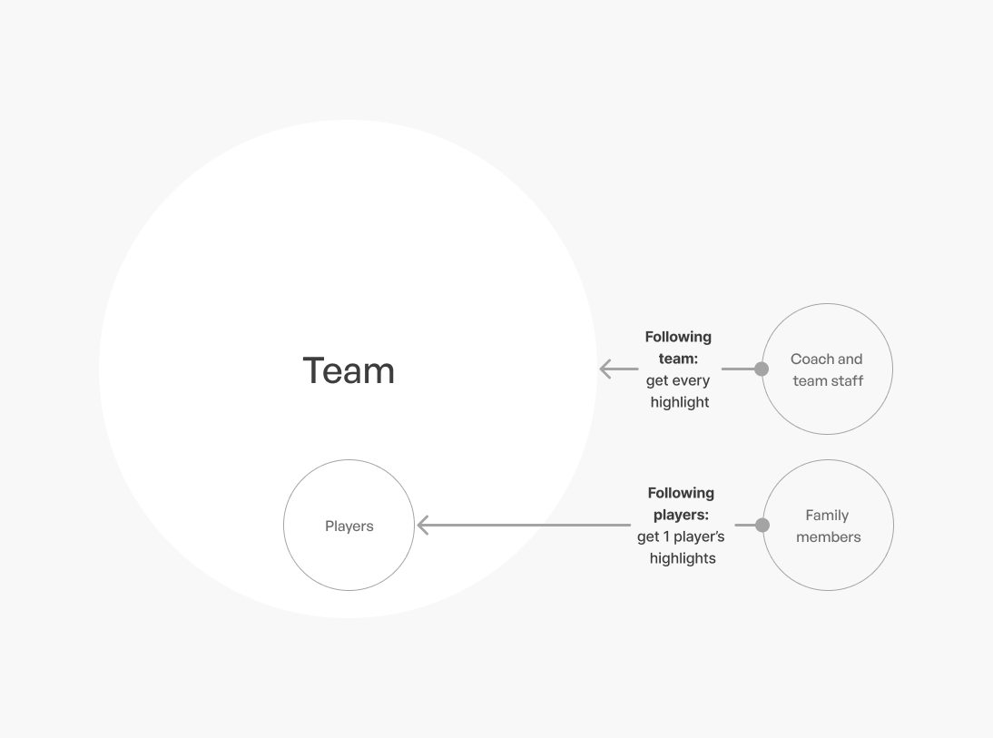 Follower/following logic
Wireframes
Developing the UX
To inspire our app's UX design, we extensively researched popular apps with analogous functionality. By studying how these apps organized their features and wireframing our own screens accordingly, we gained valuable insights into creating a layout that felt familiar and intuitive for our users. This user-centric approach allowed us to seamlessly integrate the necessary features while ensuring a smooth and enjoyable experience for every baseball enthusiast.
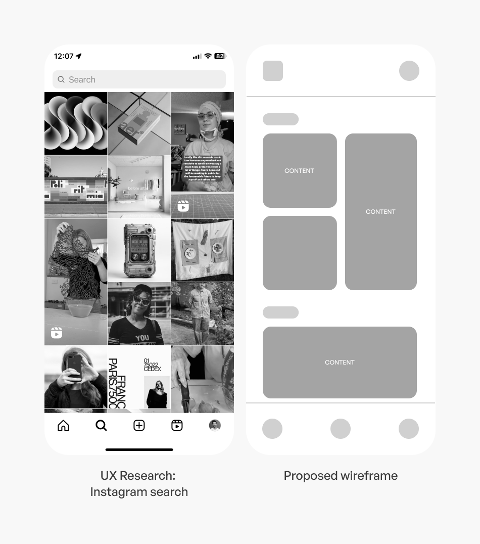
Browsing highlights
By studying Instagram's grid layout, we identified its effectiveness in presenting content through large visual thumbnails, organized in a reverse chronological order with the newest on top. This design approach allows users to quickly access and engage with the most recent highlights of their favorite players and teams, fostering a seamless and visually captivating browsing experience in the Watch Tab of our app. By incorporating this user-friendly and visually appealing grid layout, we aimed to elevate the Trace Baseball app, ensuring that users can effortlessly discover and enjoy the latest and greatest moments in youth baseball.
Watch highlights
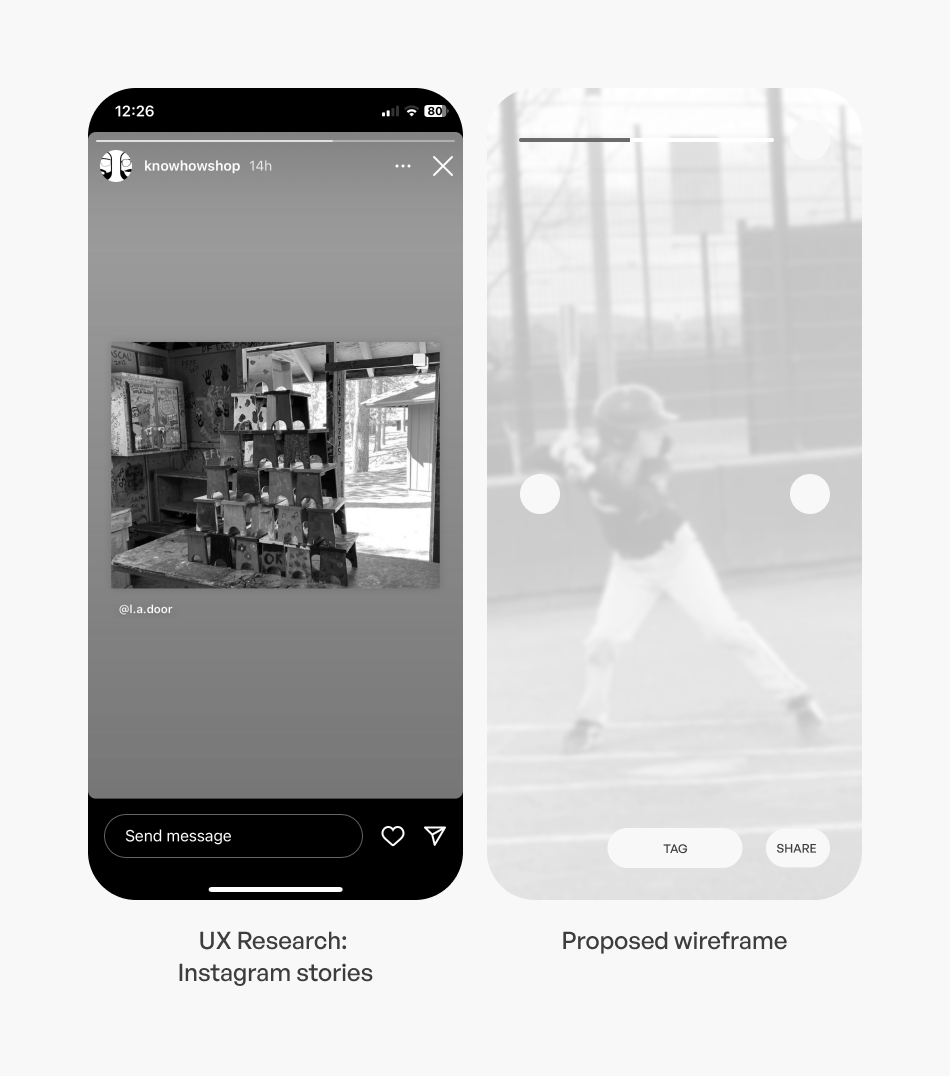
We recognized the immense popularity and effectiveness of Instagram Stories' short-form video player in delivering engaging and interactive content to users. We observed how users could tap on either side of the video to advance to the next story seamlessly. Inspired by this intuitive interaction, we implemented a similar feature in our app, allowing users to navigate through automatically generated baseball highlights by tapping on either side of the video.
Record highlights
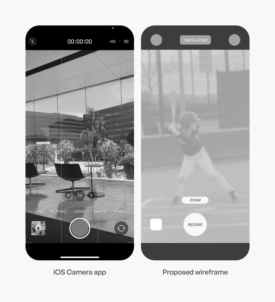
To inform the design of our recording screen, we conducted thorough research on the native iOS camera app. By studying how users interacted with the iOS camera, we identified the most essential features needed for our recording screen: zoom and a record button. By adopting a similar layout and functionality, users instantly recognize and feel comfortable using our recording screen. This seamless familiarity not only simplifies the learning curve for new users but also ensures that all baseball enthusiasts can effortlessly capture their favorite moments on the field with ease.
Share highlights
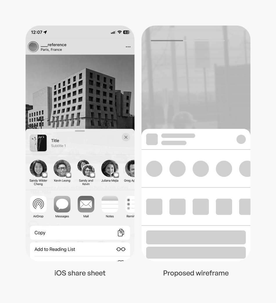
To ensure a seamless and effortless sharing experience for our users, we made a strategic decision to utilize the native iOS share sheet instead of building our own sharing functionality from scratch. By leveraging the iOS share sheet, our users can instantly share their baseball highlights to any social media platform of their choice on day one. This engineering choice not only streamlined the development process but also empowered our users to connect with their audience and showcase their skills without any barriers.
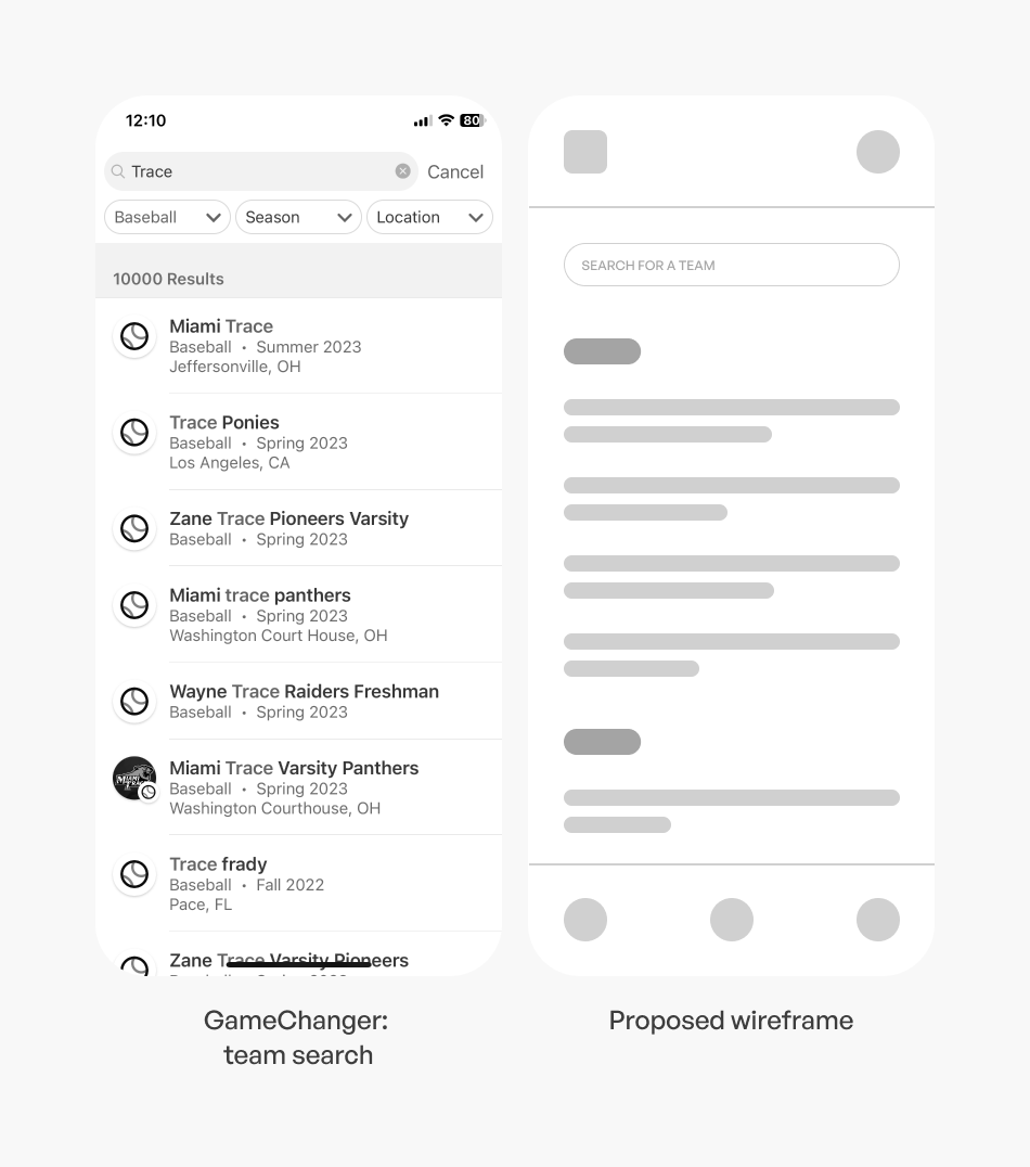
Search for a team
To inform the design of our Team Search Screen, we conducted thorough research on GameChanger, a competitor app developed by Dick's Sporting Goods. By studying how GameChanger's team search function worked and analyzing user feedback, we gained valuable insights into organizing and presenting team search results effectively. This research allowed us to refine our own Team Search Screen, making it user-friendly, intuitive, and empowering our users to easily find and connect with their teams.
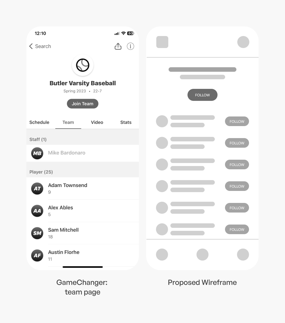
Follow a player
To inform our approach to the "Follow a Team or Player" feature, we conducted more in-depth research on GameChanger. We developed a seamless and intuitive process that allows parents to follow their child's player profile and receive highlights directly. Simultaneously, coaches and team staff can follow their team's profile to access highlights from every player on the team effortlessly.
Key insights from developing wireframes:
- Familiarity and Intuitiveness: Researching existing UX in analogous products allowed us to identify familiar design patterns and interactions that users were already accustomed to.
- Streamlined Features Organization: Analyzing how analogous products organized their features helped us structure our wireframes in a coherent and efficient manner.
- Engineering Ease and Consistency: Leveraging existing UX in analogous products also provided insights into how to optimize engineering efforts and maintain consistency throughout our app.
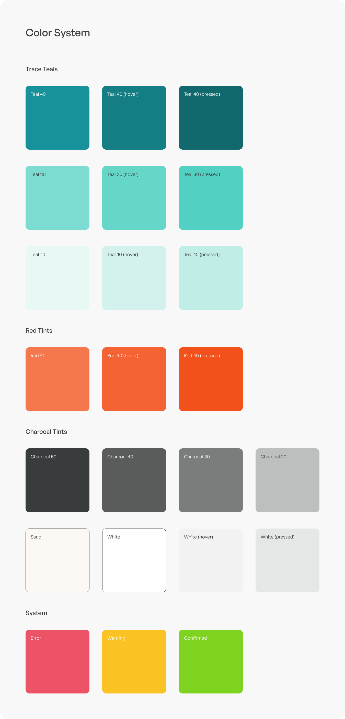
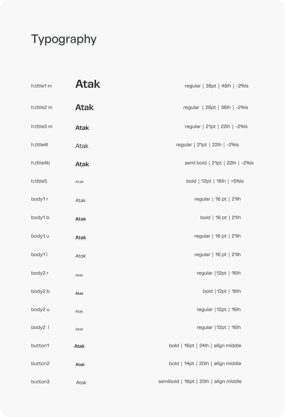
Design system
Working within the exsting Trace design standards
As the product designer for Trace Baseball, I faced the exciting challenge of developing the final visual designs while adhering to the existing Trace design system. Working within this framework allowed me to maintain a consistent and cohesive look and feel across the app, ensuring a seamless user experience.
Incorporating the designated color palette, fonts, and standard padding depths, I ensured that the visual designs remained in harmony with the overall brand identity. The existing icons were utilized strategically to maintain familiarity while guiding users intuitively through the app's functionalities.
However, in some cases, I had to innovate and originate new components to accommodate the unique requirements of new features, like the recording button for capturing those exciting baseball moments and the design of player cards, showcasing essential player information.
Throughout the design process, I balanced creativity with adherence to the design system, ensuring that the final visual designs not only reflected the essence of Trace Baseball but also presented a fresh and engaging interface for users.
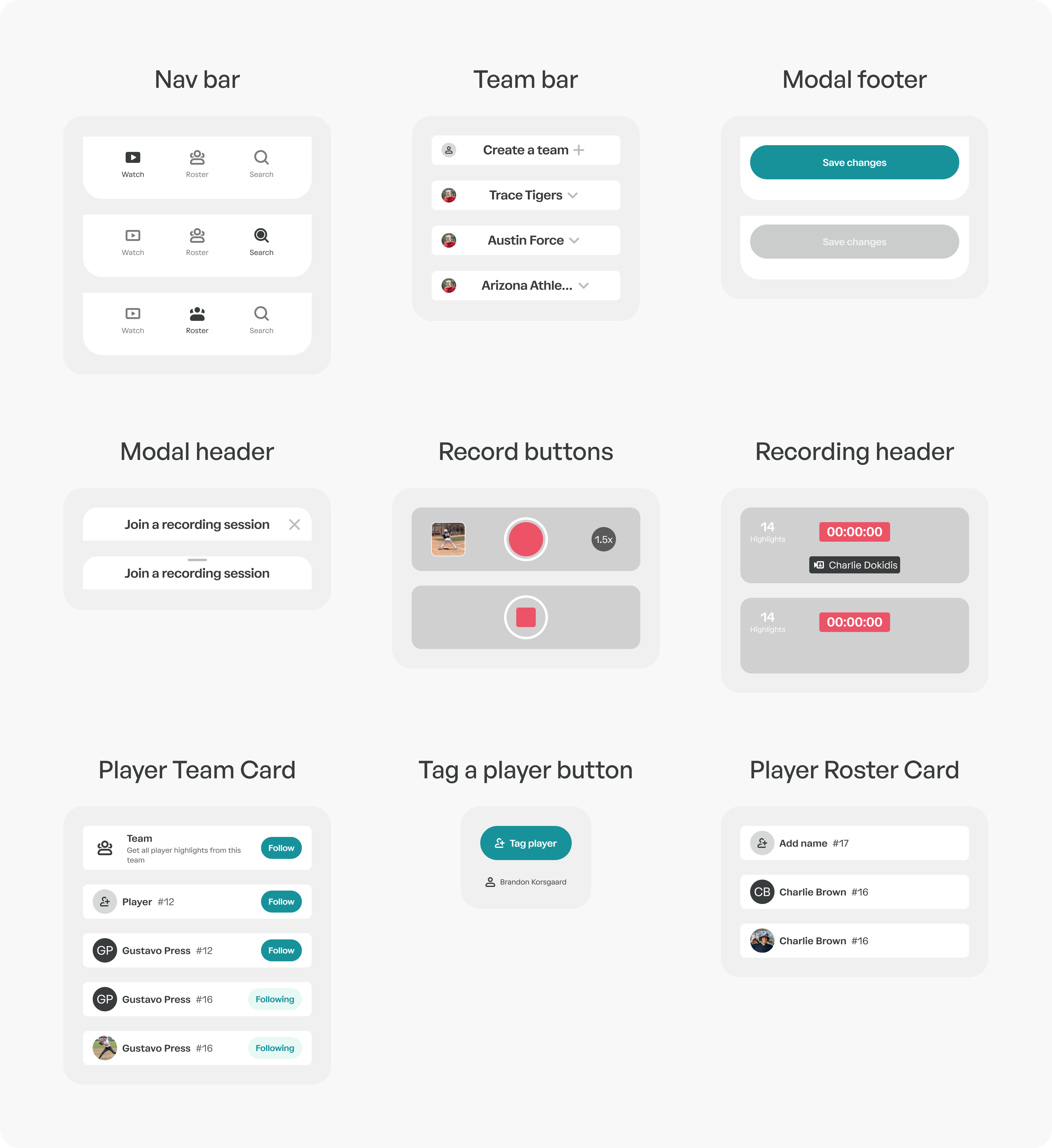
Atoms
Organisms
Usability testing
Refining the flows
In order to finalize the visual designs for the Trace Baseball app, the next step was to ensure its usability and effectiveness in meeting our users' needs. To achieve this, we focused on recruiting usability testers who embodied the personas we had earlier identified—individuals who were typical representatives of our primary user segments: parents like Rosa Alcantar, coaches like Mark Donin, and players like Isaiah Torres.
By seeking out testers who closely resembled our user personas, we aimed to obtain authentic and relevant feedback that would reflect the actual experiences of our target audience. These usability testers would play a crucial role in assessing the app's functionality, navigation, and overall user experience, helping us identify any pain points, areas of improvement, and alignment with the app's intended goals.
Usability task 1: manually tag a player
While the app efficiently auto-tags players based on roster information and OCR detection, we wanted to refine the design for situations where user intervention was necessary.
Through usability testing, we discovered that the original design lacked visual prominence, leading users to overlook untagged highlights. To address this, we made a strategic design change, implementing bright teal tags and buttons on untagged highlights. The eye-catching color drew users' attention to the untagged portions, making the action required more apparent.
To further enhance clarity, we used micro copy that read 'Tag a Player' on these buttons. This concise and instructive text provided users with a clear understanding of the action they needed to take, eliminating any ambiguity.
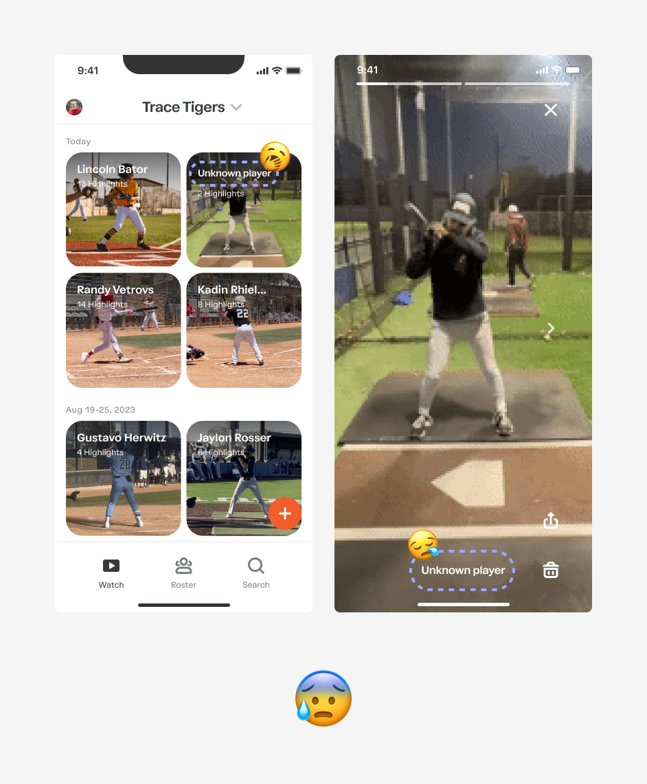 The visual design of untagged players was too visually quiet, and many users did not understand that this highlight was not tagged.
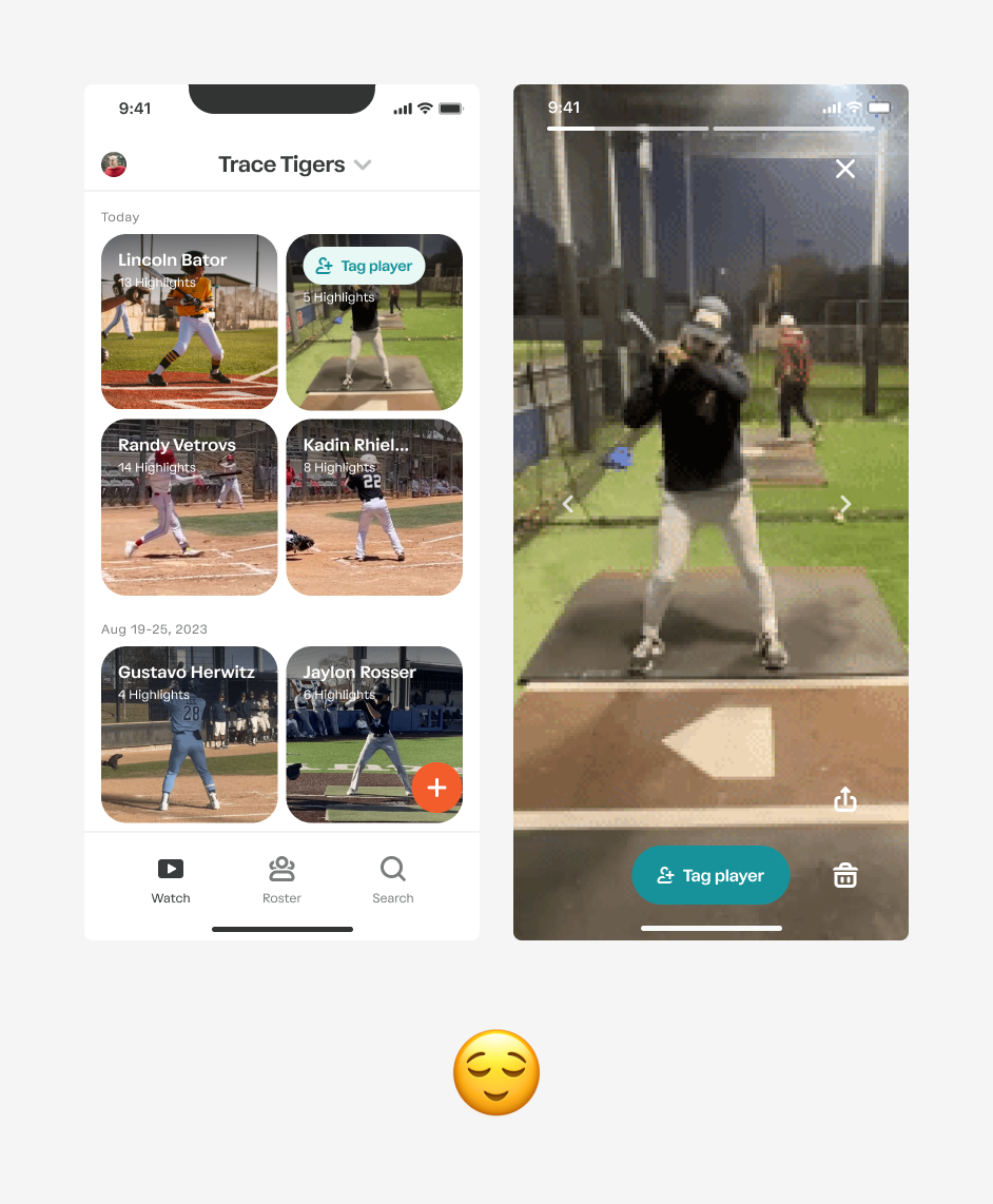
With more prominent buttons and ‘Tag a player’ prompts, users could easily figure out how to tag players, just by pushing the big bright button.
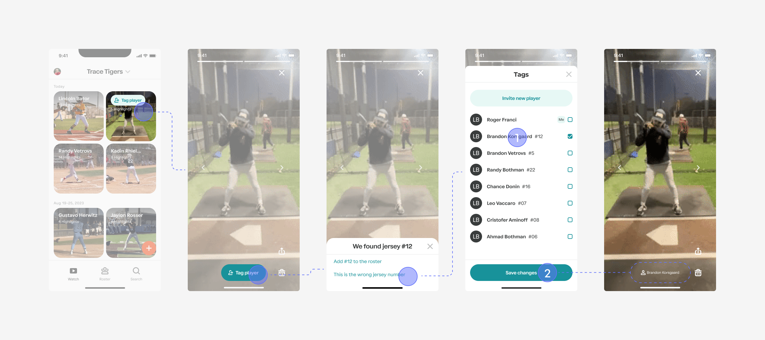 Final design of the flow to tag a player
Usability task 2: follow a team or a player
Initially, the design featured a prominent "Follow Team" button at the top, followed by individual players and "Follow" buttons for each.
However, through usability testing, we discovered that users had difficulty understanding the implications of "Following a Team." To address this, we made an important design refinement by incorporating informative microcopy. The microcopy was strategically placed to explain that "Following a Team" meant receiving highlights for every player on that team.
By implementing this clear and concise explanation, users immediately grasped the functionality of "Following a Team" and could confidently engage with the feature. The revised design not only improved user understanding but also ensured that both parents and coaches could effortlessly follow their respective teams and players, receiving highlights with ease.
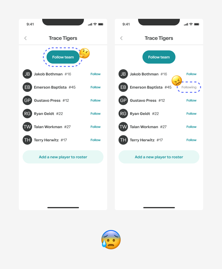 Users were confused by the follow team button, and users thought that the ‘following’ button state was disabled
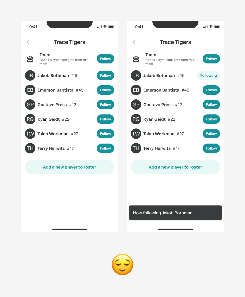 Subtext helped explain what it means to follow a team. We added a toast to confirm the action.
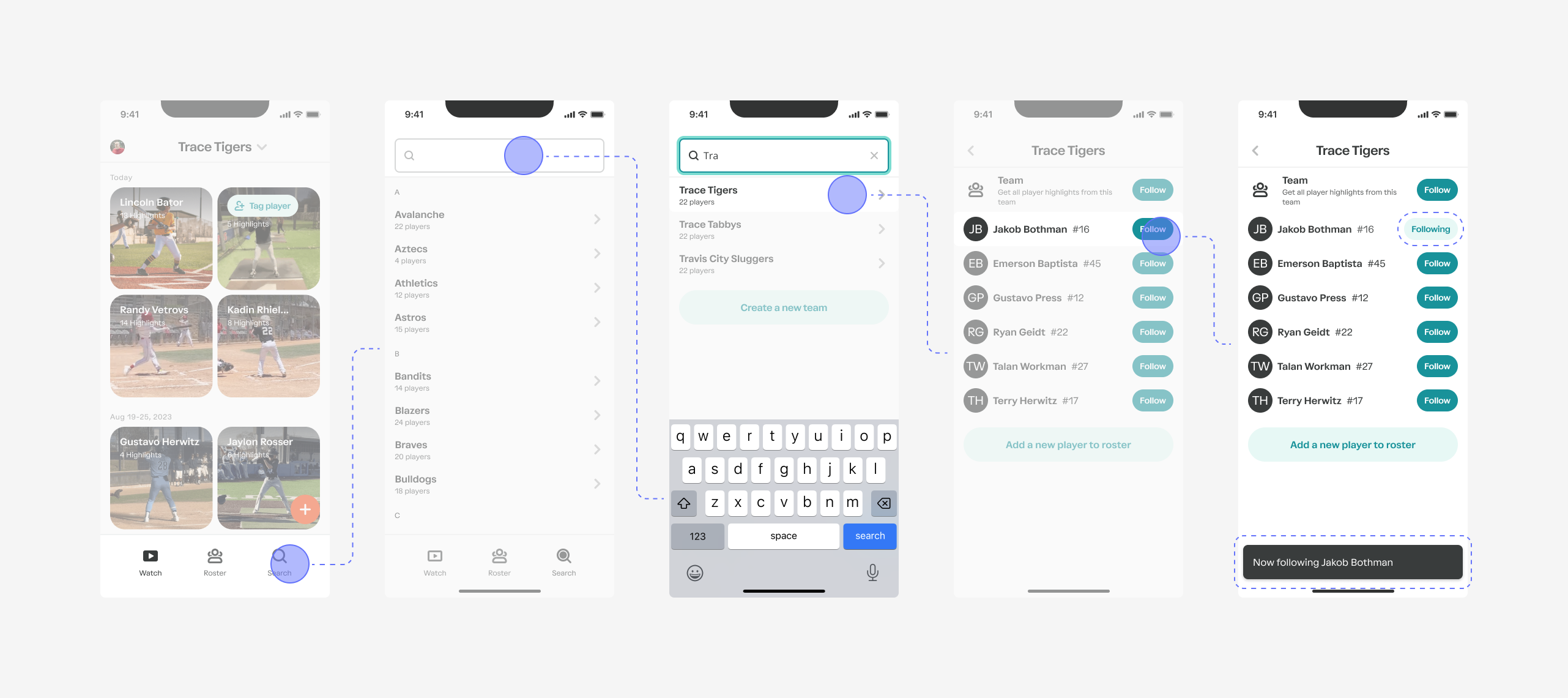
Final design of the flow to follow a player
Key insights from usability testing:
- Clear Microcopy Enhances Understanding: Microcopy that clarified actions, such as "Tag a Player" and "Follow a Team for Highlights," reduced confusion and empowered users to make informed decisions.
- Prominence of CTAs Influences Engagement: Designing the "Follow Team" button to clearly explain its purpose led to increased adoption, while visually appealing "Follow" buttons for individual players encouraged users to actively connect with their favorite athletes.
- Visual Cues Improve Navigation: Bright teal tags and buttons for untagged highlights and visually distinct elements for following players and teams improved overall user navigation and ensured a smoother experience.
- Familiar UX Elements Boost User Comfort: Drawing inspiration from successful social media platforms like Instagram, users quickly adapted to similar features in the Trace Baseball app. Familiar UX elements, such as the native iOS share sheet and Instagram Stories-inspired highlight playback, contributed to a more comfortable and intuitive user experience.
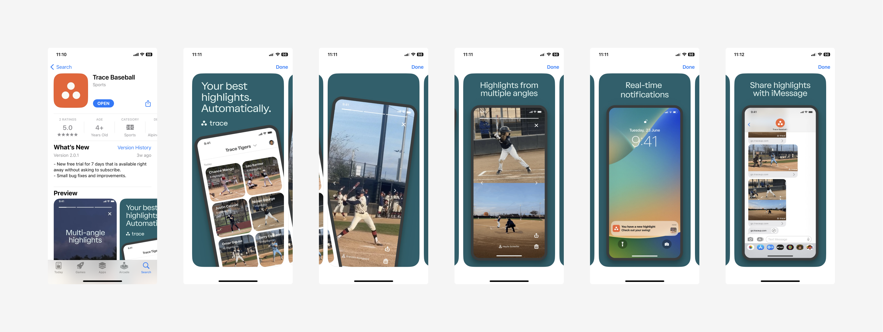
iOS App Store page
Brand design
Designing the images for the iOS app store page was an exciting opportunity to showcase the essence of Trace Baseball and entice potential users to explore the app. To achieve this, I carefully crafted visually compelling screenshots that highlighted the app's key features, such as capturing baseball highlights, creating highlights, and easily sharing them on social media platforms.
In addition to static images, I created a captivating video preview that walked users through the app's basic features in a fun and engaging way. The video provided a dynamic and interactive experience, giving users a taste of the app's seamless navigation and exciting functionalities.
 iOS App Store page
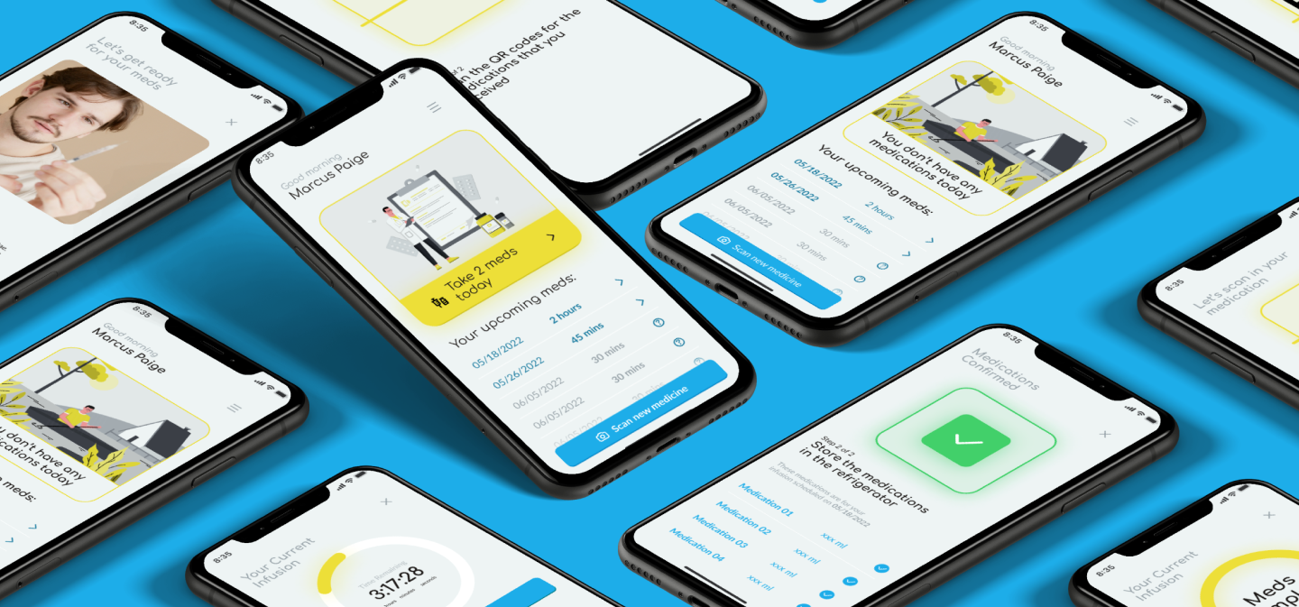 Up next