![]() Claimsmart
Claimsmart
 Claimsmart
Designing a better experience after an automotive collision
Product Designer
Auto insurance
Self-guided study
In Brief
In response to a frustrating car accident experience last February, I decided to create an all-inclusive mobile app that streamlines insurance services. The goal is to provide users with a seamless and hassle-free experience when dealing with insurance claims and interactions.
Last February, my partner and I went out to one of our favorite burger joints in East Hollywood. On our way back, while waiting at a redlight, our car was struck from behind, and pushed forward into the car waiting in front of us.
We were able to pull off to a nearby parking lot to exchange information with the other drivers and assess the damage. The event set off a number of disparate tasks requiring me to gather and transfer information between a number of different businesses.
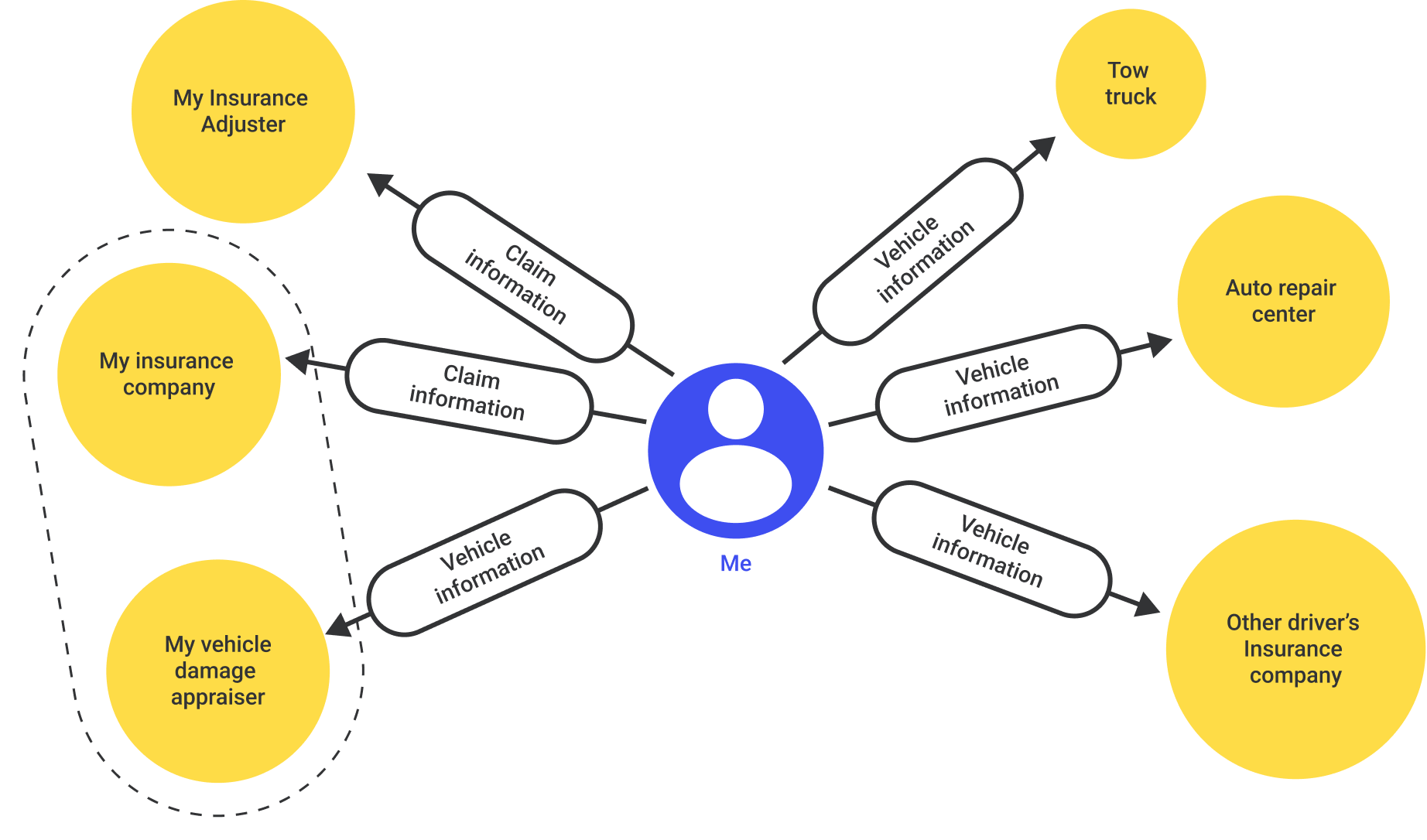
Diagram of communication required after a car collision
Traditional Claim filing
My experience taught me that when it comes to getting an insurance claim filed, you stand at the center of the a nexus of communication. I had to serve as the mediator between my insurance agency and the tow truck company, the auto repair center, and the other driver’s insurance company. This lead to a tremendous time waste for me, as I had to track down phone numbers, wait on hold, slowly retell my story, and then gather information. After gathering information, I had to then call back people I had already spoken to to courier information. In the diagram above, you can see that I stood in the middle of a constellation of other entities, relaying information between them. As a designer, I couldn’t help myself but imagine a better way.
Another existential problem with this model is that it places me, the individual with the least knowledge about this process at the center. Half of my time was spent learning what kinds of information I would need from others, and the other half was spent actually gathering that information.
Desk Research
I conducted research into the apps that my insurace company and the leading competitors use. I found that the vast majority of insurance apps bury their help functions, leaving them difficult to find in times of need. On top of that, most apps end user flows with calling an agent, a process that can leave you on the phone waiting on hold for multiple hours. In regards to UI, most apps have very small copy text and small buttons. If, like me, your hands are shaky after a collision, small buttons don’t provide a big enough to tap. Finally, I found that most insurance apps have overly-complicated navigation menus. Some require you to swipe through a list of your covered vehicles to get to the services, others require you to swipe horizontally through a list of up-sales to get to a list of services that are included with your coverage. Finally, when calling a tow truck, we were supposed to get a text with their arrival time, but the text never came, and the truck was over an hour late.
Key insights from desk reseach:
- Place services in the app in a visible, easy to find location.
- Provide ways for users to handle simple tasks without calling an agent.
- Include a graphical representation of any arriving services like tow trucks or ride share.
- Use large, legible text and big tappable buttons.
Streamlined Claim filing
In rethinking the process of filing a claim, I wanted to take myself out of the center of the network. Instead, a central service could stand in the middle of the process and serve as a repository of all key information. I could provide all of my information to that service, and it could provide an intermediary between myself, my insurance company, the tow truck company, the auto repair center, and anyone else needing to help out to close out my insurance claim. This way, I’m not spending time waiting on the phone just to tell yet another group the same information that I’ve already given to others. This began to define the scope of services that would be handled by the app.
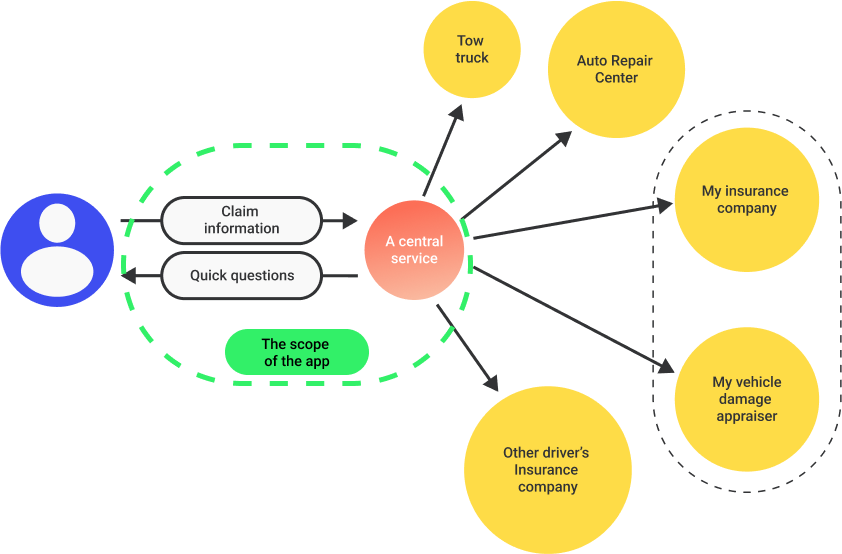 Filing an insurance claim, re-imagined with less redundancy
Product flow
I used my previous auto collision experience as research to develop a product flow that could prompt a user to gather necessary information at the right time, process that information, provide access to necessary services, and then file the claim without asking users to play phone-tag to relay redundant information.
Based on my experience, I surmised that the primary flow should be as follows:
- Collect a report of what happened.
- Collect photos of the damage.
- Collect insurance and identification information from involved drivers.
- Schedule a tow truck.
 Expanding the claim filing process into a product flow (click to expand)
Key insights from developing the product flow:
- I added a couple of steps at the beginning of the flow to offramp users if there was a serious injury
- My tow truck took almost an hour to arrive on the scene. I rearranged the flow so that the tow truck would be called sooner, and users could finish the rest of the flow while they were waiting.
- I added a quick flow to arrange ride-share, in case the tow truck is not going to the user’s residence and they need a ride.
- Some users may not want to fill out their claim information at the time of the collision, so I added a quick flow to confirm time and date of the incident.
Wireframes
Next, I started to imagine how to visually organize inputs and outputs that might be necessary to accomplish each little task laid out in the product flow. I started backwards, beginning with the last step in the process of the incident report and working towards the first. This helped me to eliminate redundant information asks. I worked to create screens that would be as lean and clean as possible, eliminating all but the most essential fields and information prompts.
To start visualizing these processes, I thought back to my experience manually logging information after my own collision. My mind was racing the whole time and I couldn’t focus on much. In developing wireframes, I tried to isolate one key action per screen, such that distracted or even traumatized users would be able to more easily understand the process.
 low-resolution wireframes (click to expand)
Key insights from developing wireframes:
- Visual cues should be as simple and clear as possible. I stuck to one input per screen.
- I left ample room for simple educational text that could gently guide users throughout the process.
- I oversized the buttons and inputs to help make things easier to read for users who may be shaken after a collision.
- This app could be particularly useful for new drivers who may need more help with this process. I added a few screens to allow users, like parents, to view their collision information that has been shared with them.
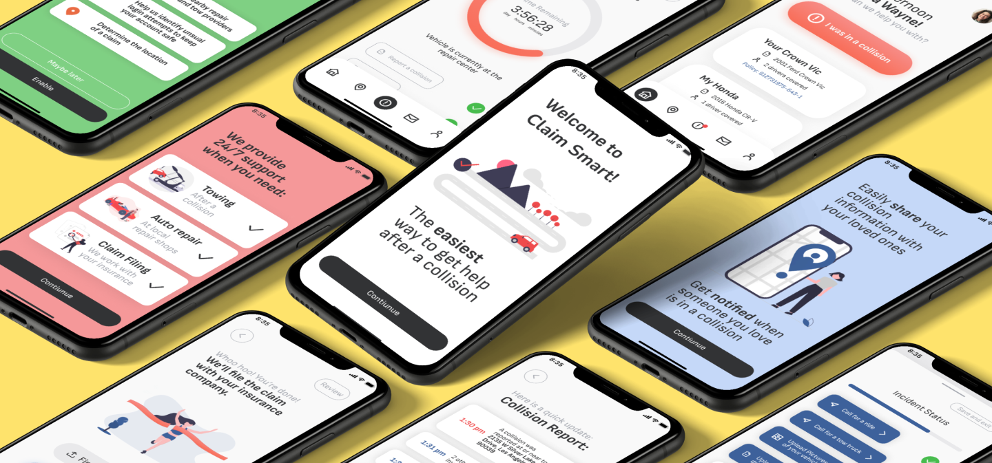
High-resolution mockups
Home screen
In developing the home screen, I knew that there should be a big bold button to start the collision help flow. The next screen that a user sees asks about any serious injuries. If there are, the user is prompted to dial 911, if there are not, the user proceeds to the next step.
The home screen, with a big bright “I was in a collision” button
Time and date input
Recording the date and time
At each stage of the process, users are first greeted with an informational page that quickly explains the next step.
If the collision occured ‘right now’, the user can select that option and proceed to the next step. If the collision occured some time in the past, the user is given a time and date picker to enter the time and date of the collision.
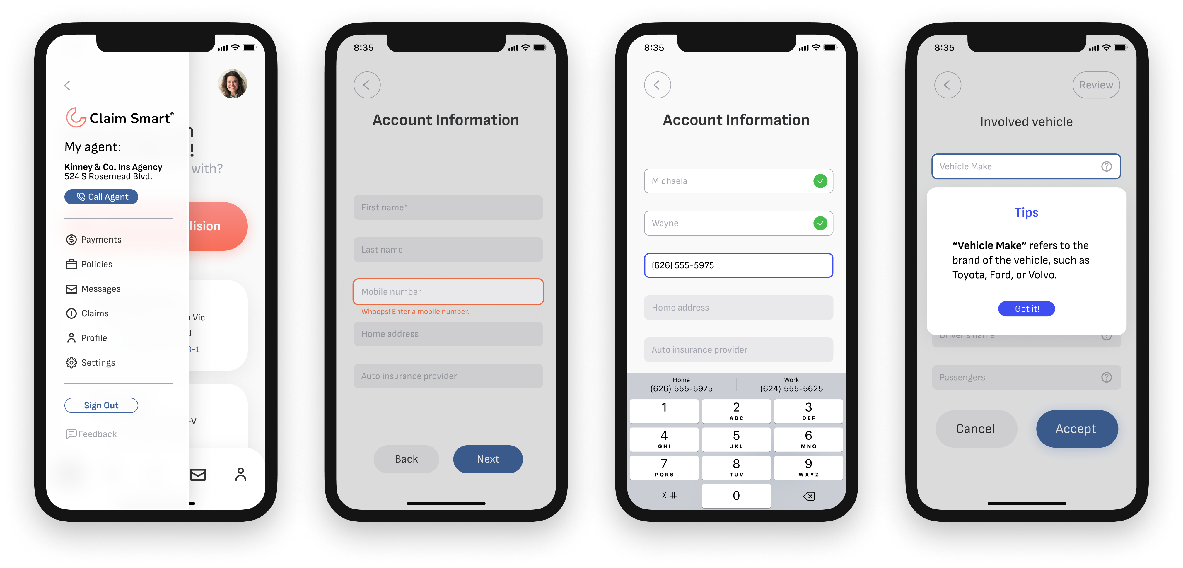
Calling a tow truck
If a user selects “Right Now” as the time of the incident, they will be offered a tow truck. If they need one, they can enter the location of pickup, or tap the location arrow to use their current location as the pick up. They can select their drop off point, or see a menu of in-network service centers, if they so choose.
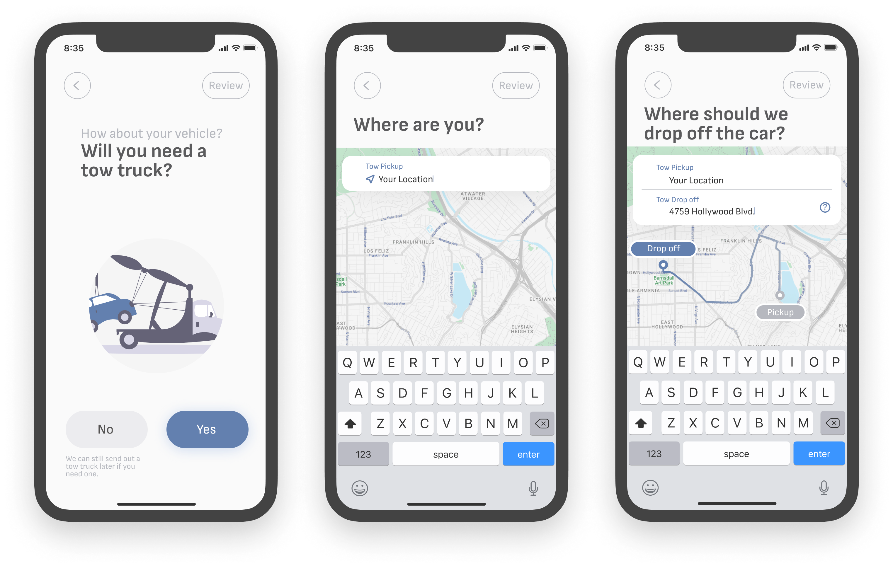
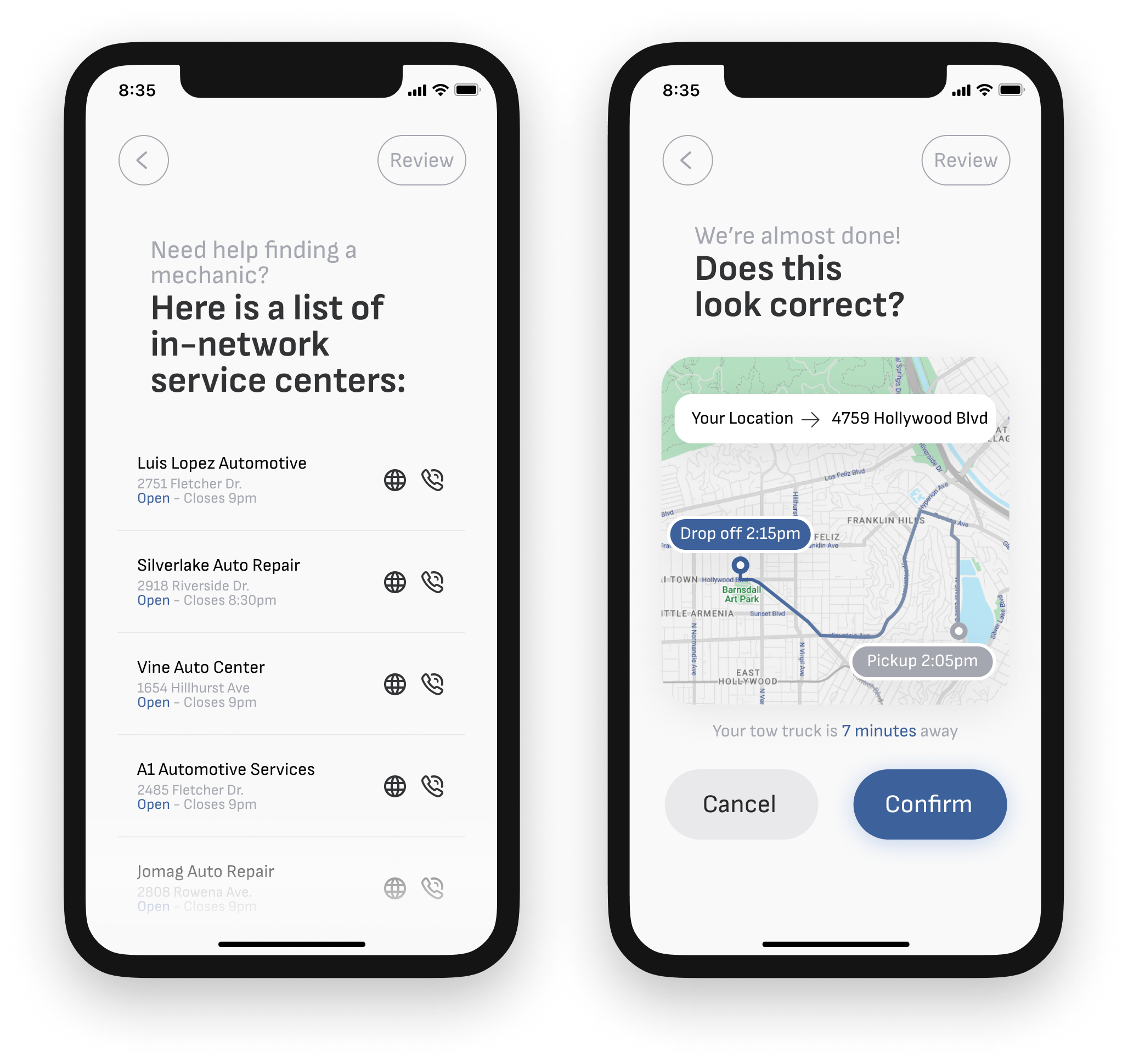
In-network service centers
When towing a vehicle, some users may not know where they can drop off their car. If they tap the help button inside the “Tow drop off” input field, they will see a list of in-network service centers to choose from. The list informs users of the hours of operation for the phone centers and
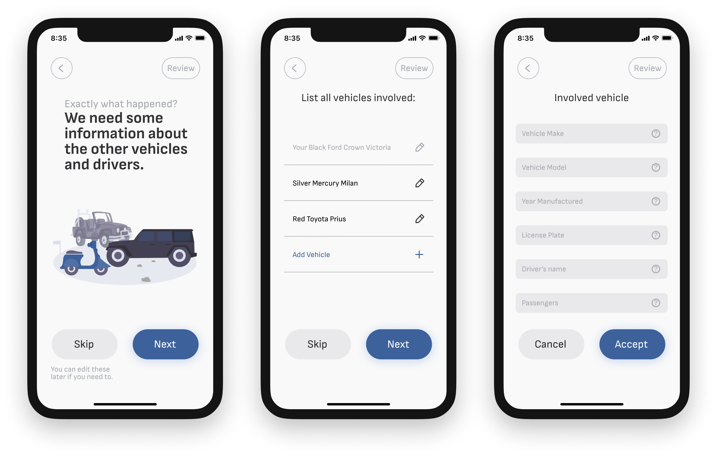
Other vehicle information
Next, the user can easily record information about any other drivers involved, including their vehicle description, and any vehicle damage or injuries they may have sustained.
This page serves to both collect information, as well as educate users on the process. Each input field has a help button to provide further information to users.
 Inputting other driver information
Photos of the damage
After collecting details about the damage, users are prompted to take photos of their’s and any other involved vehicles. For each photo, users can add a note to provide more details about the damage. When they are all done, they are presented with a grid of the photos that they took so they can review before submitting.
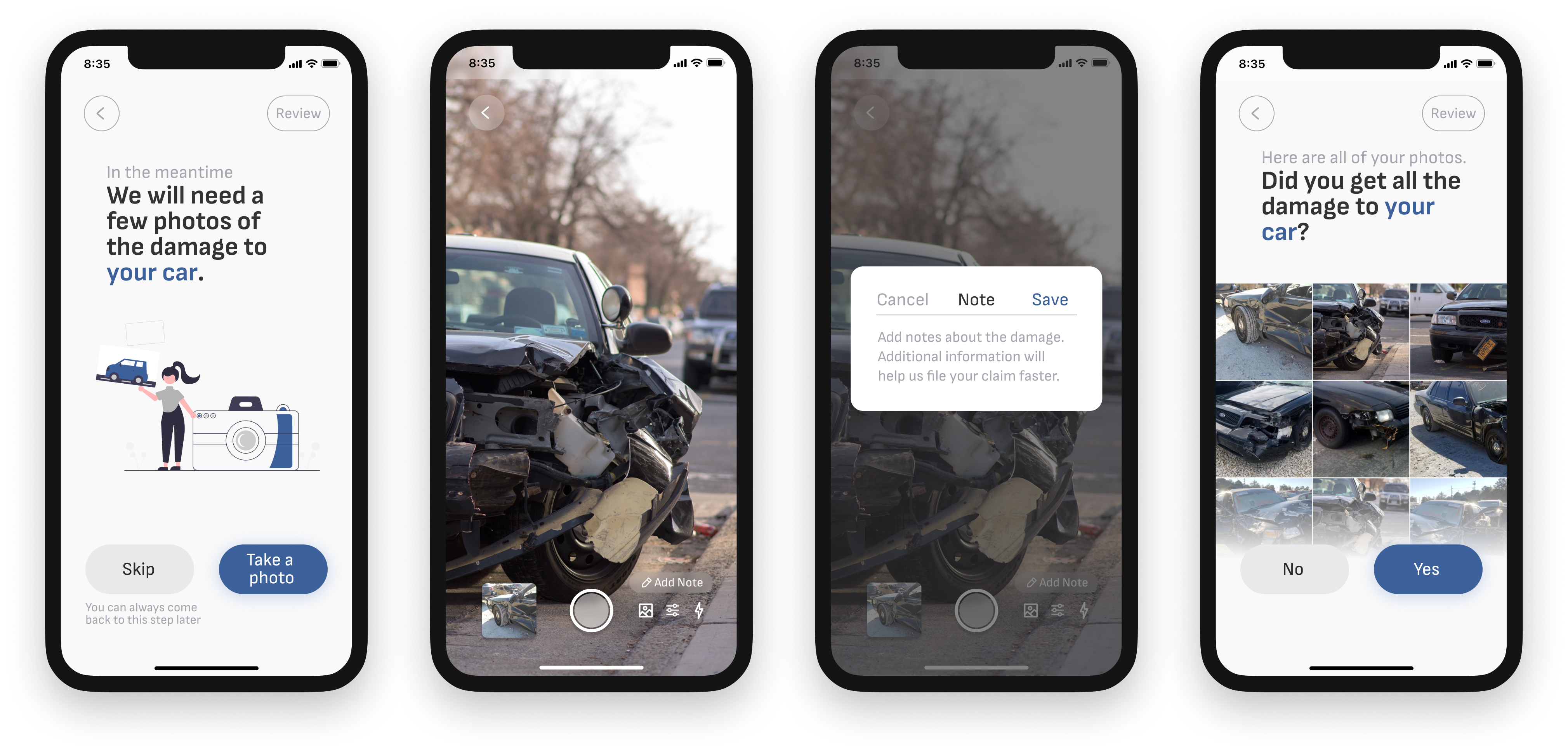
Photo input flow
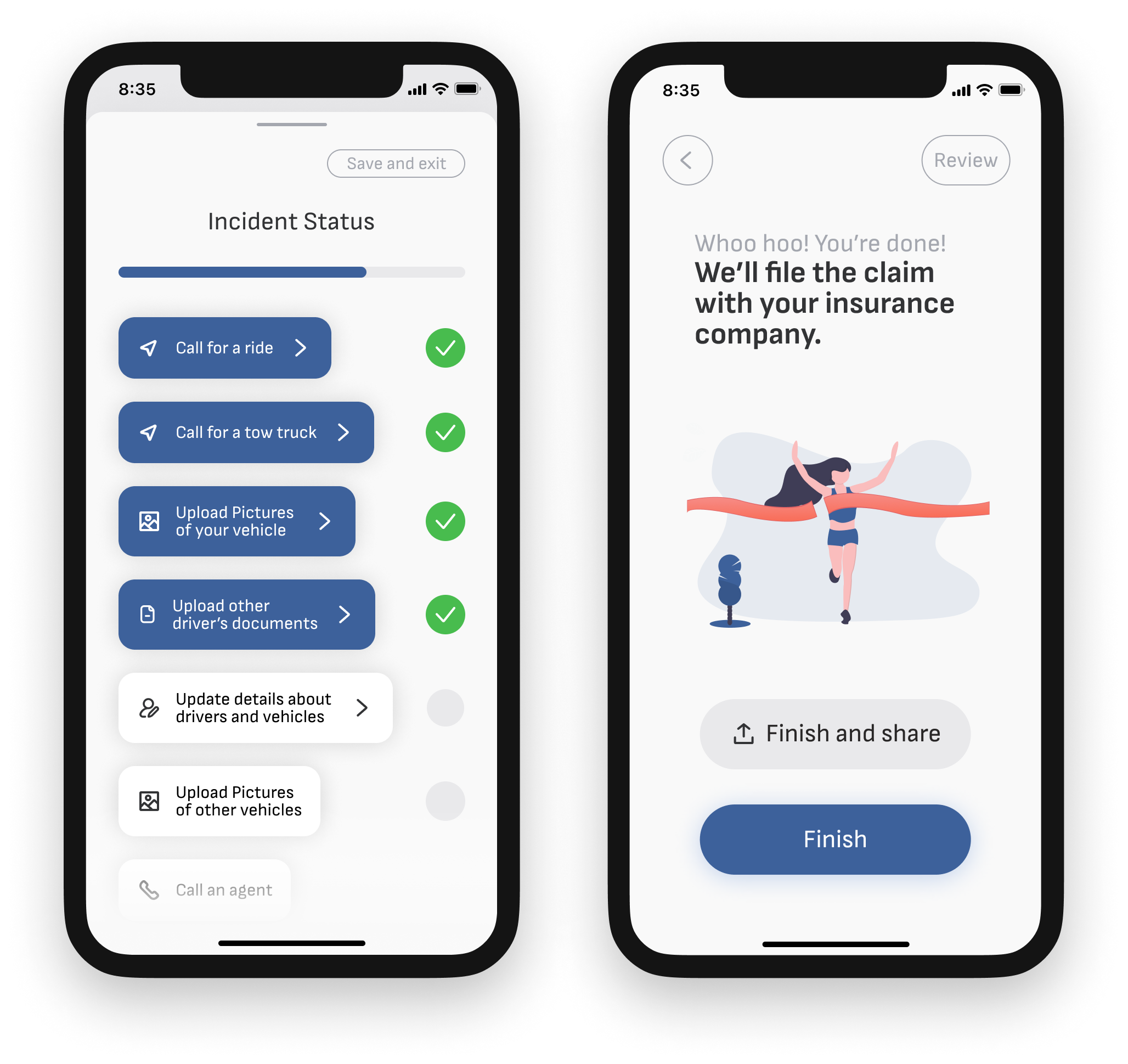 the finish line
Review and finalize the claim
Throughout the process, the user can review their progress or skip ahead by pressing the “Review” button in the top right corner of the screen. A drawer slides up from below to provide a checklist of what times have been completed and what information remains to be collected.
At the end of the process, users are shown a quick review of the steps in case they would like to go back to any, and if not, they can finish the claim and submit the information to their insurance agency. If they so choose, users can share their collision information with a trusted friend or loved one. This could be great for new drivers who may want to share information with their parents.
Monitoring your claim
After a claim is submitted, users can monitor the claim on the Vehicle Repair Status dashboard. A large timeclock counts down to the estimated time when the claim will be closed out, taking into account transportation times, damage appraisal times, repair times, and othe pertinent processes that need to happen behind the scenes.
A checklist helps users keep track of these items and informs users of what’s been done and what’s coming next.
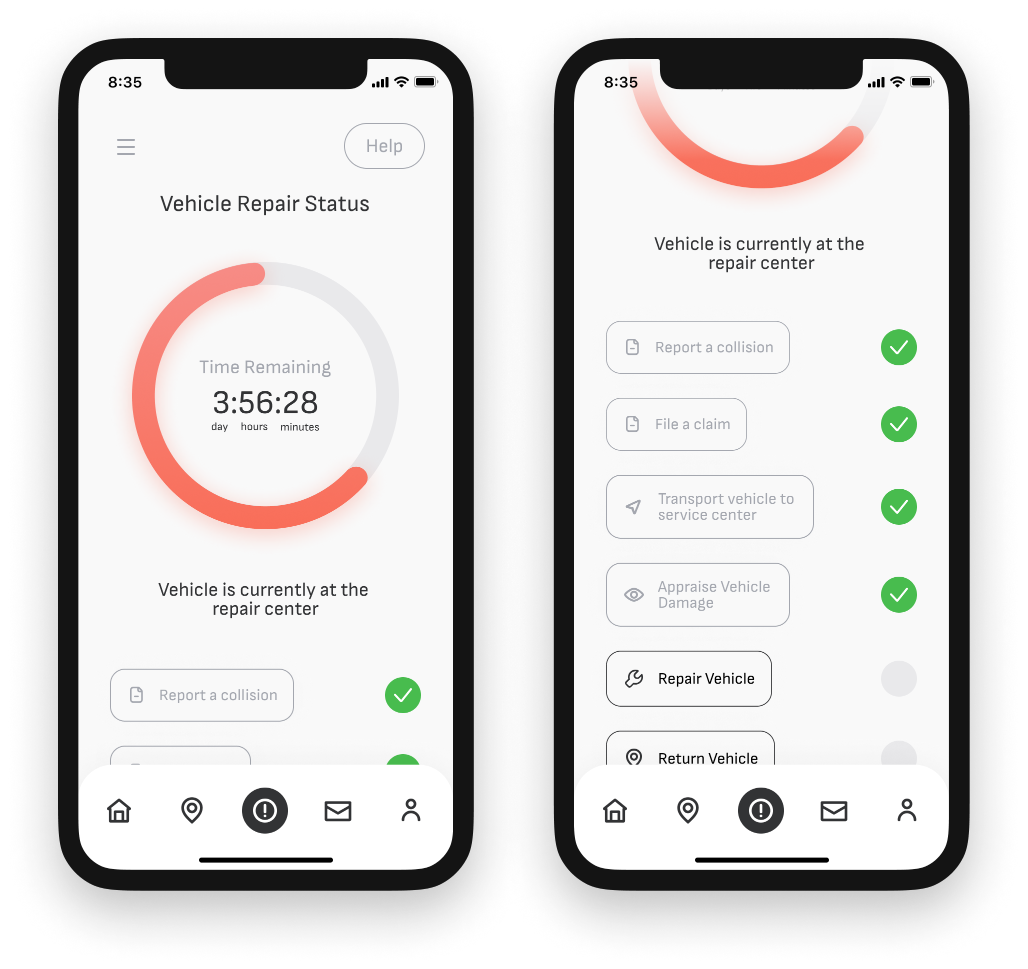 Vehicle repair status dashboard
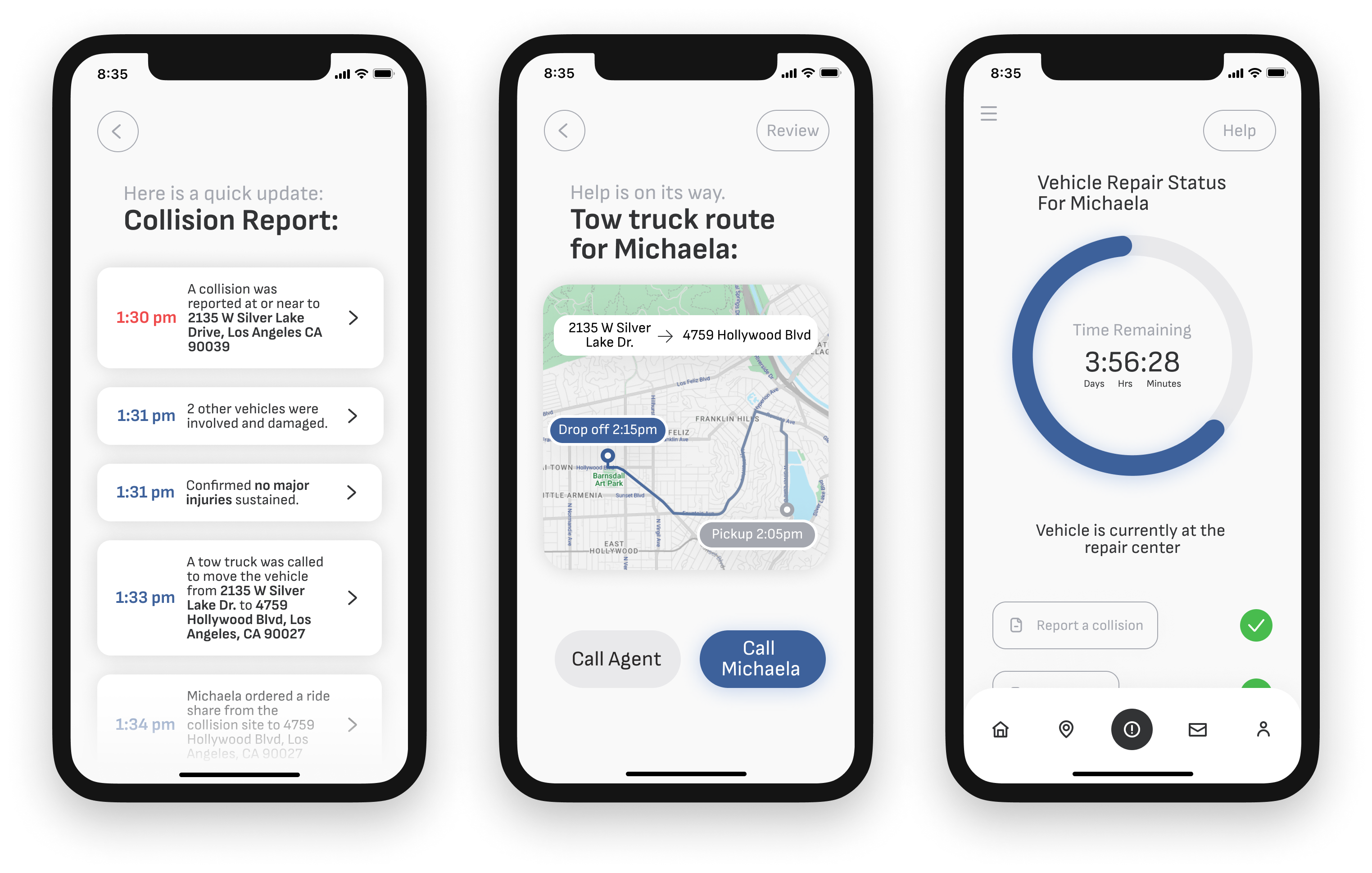
Parents or other trusted individuals can observe the progress of claims that have been shared.
Sharing collision information
If a user chooses, they can share their collision information with a trusted person. If they do so, that person will be greeted with a notification of the shared status. That person can then open the app to see an itemized timeline of the events of the collision, as well as a real-time map showing any in-coming tow truck, rideshare, or other services. They are also able to see a version of the vehicle repair status dashboard to follow the progress of the claim.
Onboarding
All of these features are introduced in by a quick onboarding flow that educates users about the features of the app, and only after explaining functionality, requests permissions for location services and notificiations. The onboarding screen for notifications freatures a set of switches so users can adjust their notification settings immediately after install.
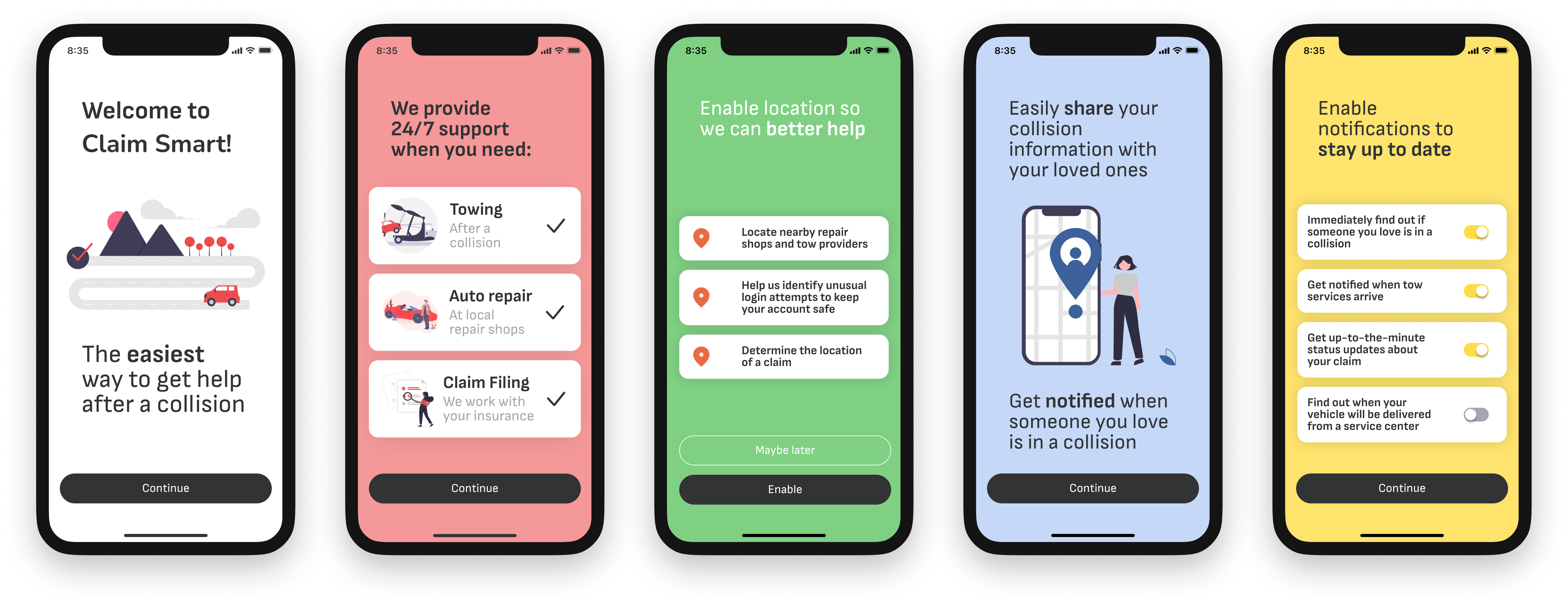 Onboarding screens
Sign up and login screens
Sign up and login
After the onboarding screen, users are prompted to sign up or login. Text entry fields were designed to be as clean and simple as possible, quietly guiding the user through the process.
Alerts and popups
The visual environment of the app was concieved as a neutral backdrop with high-contrast, highly visible buttons. The graphical vocabulary for the alerts was developed to compilment the overall design system, while using a color pallete different enough from the rest of the app to catch the user’s eye without feeling harsh.
 Alerts, notifications, and feedback
Key insights from developing a high-resolution mockup
- Eye movement is key to maintaining a user’s attention through a flow.
- Copy text should provide clear instructions about what has just happened and what is going to happen next.
- Only one or two actions should happen per screen to keep from confusing users.
Design System
Design style guide
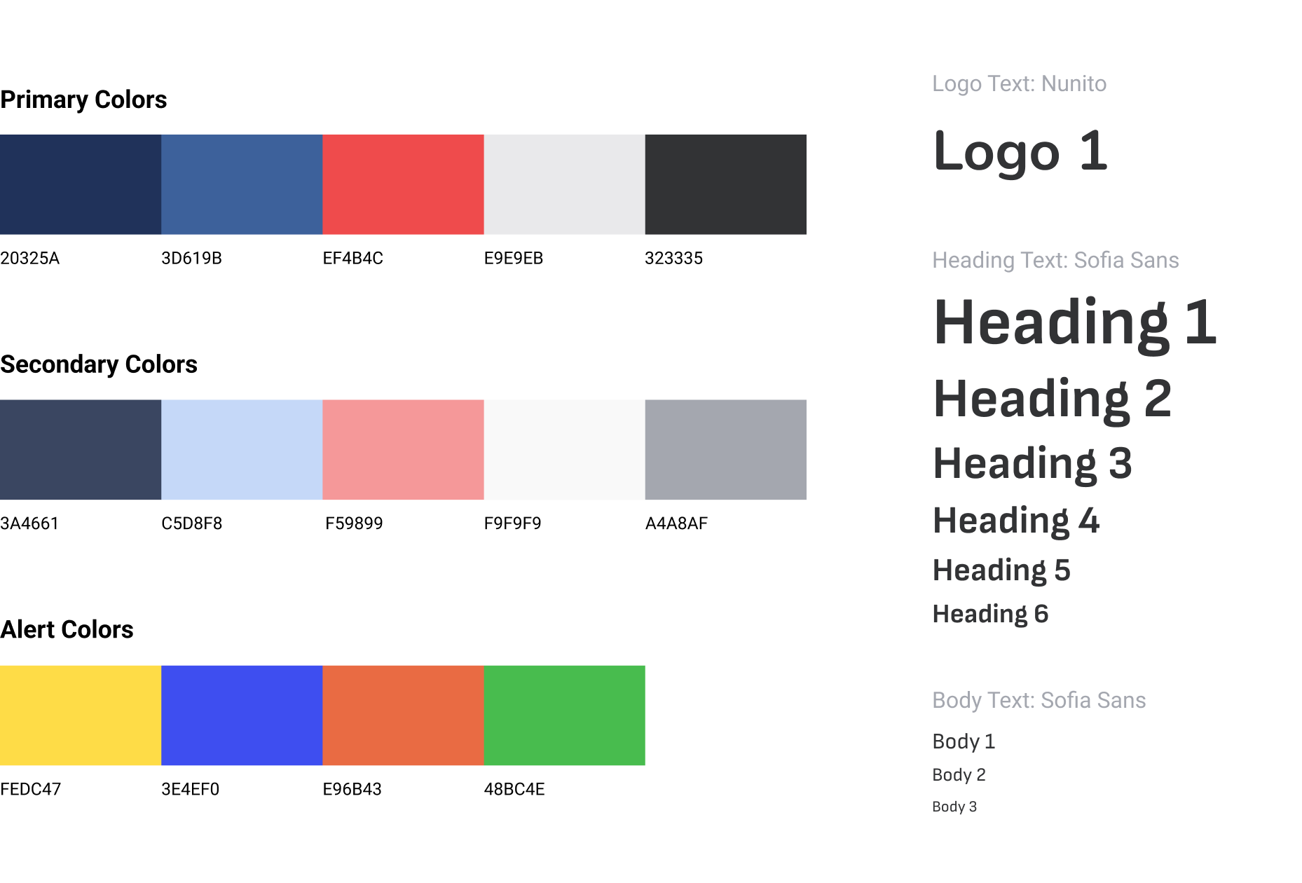
A design system built to invoke trust
When providing service to a person in need, a servicer should evoke trust, confidence, professionalism, calmness, and strength. The primary and secondary colors that make up the majority of Claimsmart’s visual ecosystem were selected to invoke these feelings in users. The UI utilizes a largely white background with high-contrast blue buttons. The color blue is known to evoke feelings of trust, loyalty, strength, and calm. The color pallette was designed to facilitate a high-contrast environment that would be accessible to all users, even those in a distressed or distracted state of mind.
The font, Sofia Sans, was selected because of its high legibility at different scales. The geometric quality of the font helps reinforce notions of trust and reliability.
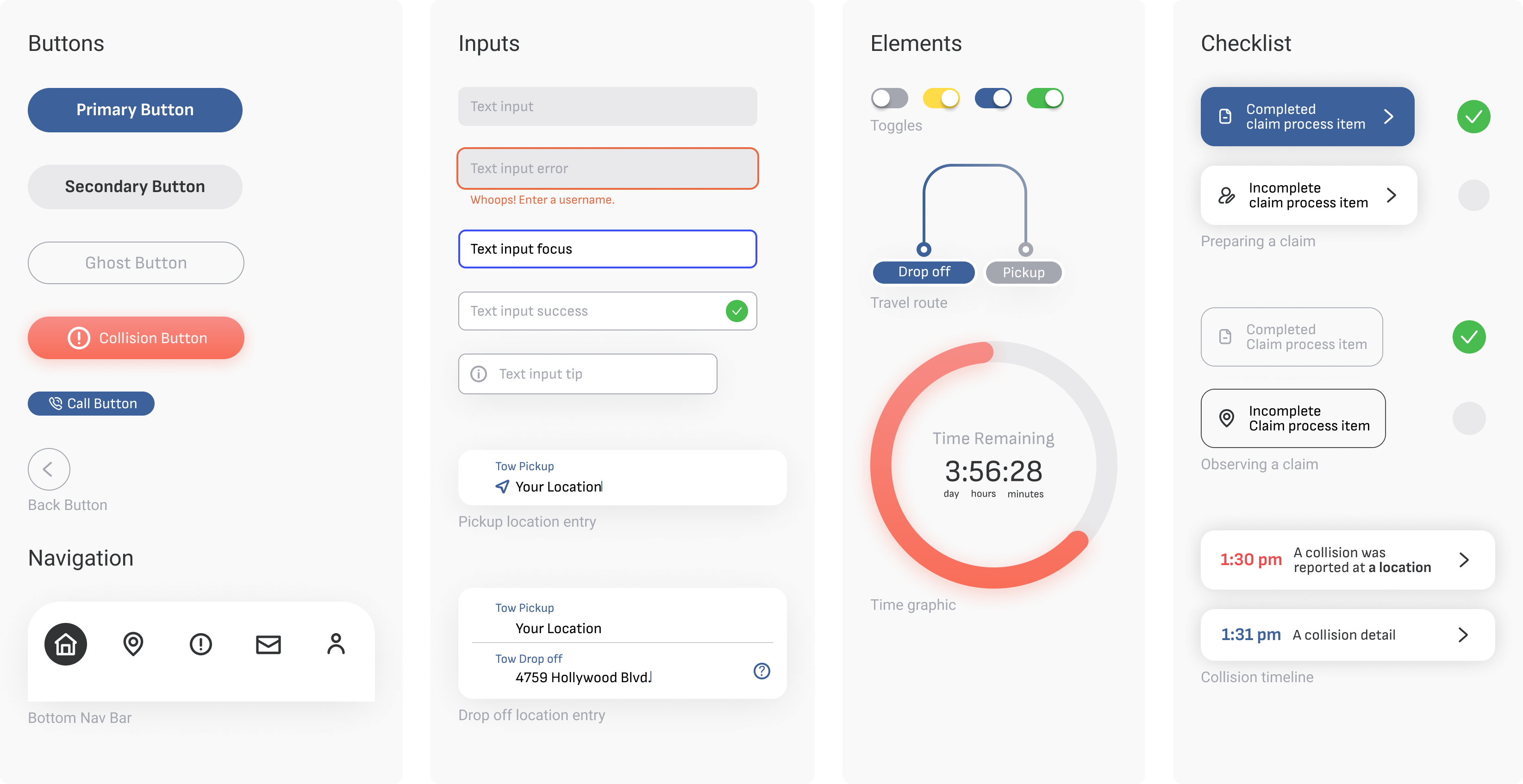
Components
Components made for accessibility
The graphical components of the UI were designed to maximize legibility and passively educate users about their functionality. Buttons are bright, bold, and oversized. UI elements like check lists do double duty, providing users with background information if tapped.