![]() Hestia Medical
Hestia Medical
 Hestia Medical
Designing a way to take complex medications at home
Product Designer
Medical device
Freelance consulting
In brief
A medical device manufacturer had developed a new product to help patients take complicated medications, like intravenous infusions, from the comfort of their home. My task was to design an app to help patients at the beginning, during, and after that process.

Design Research
We began this project by familiarizing ourselves with the medical device and the way it needs to interact with patients to deliver them the medicine they need. The device is a small unit about the size of a loaf of bread. A patient receives new medications in the mail in the form of cartridges, scans a QR code to confirm prescription and dosage, and then stores the medicine in their fridge. At the time of a scheduled infusion, they load the necessary cartridges into the device, and perform the infusion at home. We identified 3 necessary activities that the app would need to facilitate.
Key App Objectives:
- Scan new medication to confirm correct dosage and prescription.
- Walk the patient through the steps of assembling the device and loading it with medications.
- Helping the patient monitor their infusion process.
 Flow diagram
The next step was to visualize how these three key processes would need to interact. As the same time, the client had key data to share: many of their patients are older, and find it difficult to read instructive text off of their mobile device. In response to this, we developed a strategy to pair the mobile app they were developing with a TV based app, which would have larger text and be easier to read.
Some patients will have infusions that span multiple hours. During that process, they may want to watch TV to pass the time. For that reason, I made a design recommendation to have complete parity between the TV and mobile apps. If a patient was undergoing an at-home infusion, they are free to change to a streaming app.
Key insights from Design Reseach:
- We need to design an app that will carry out the 3 Key Objectives of medicine confirmation, step-by-step instructions, and infusion monitoring.
- We need to design a TV app and a Mobile app.
- The two apps need to have hand-off capability at any point in the process
Wireframes
Having a clear idea of the product flow and necessary screens, the next step was to develop wireframes to visualize the screens and locate information items and key CTA locations. This process was also key in aligning the mobile and TV apps, ensuring that the hand-off could be achieved seamlessly at any moment in the process.
Key Wireframe Objects:
- Establish home screen organization
- Establish QR Scanner screen organization
- Establish medication confirmation screen organization
- Iterate setup instructional screen organization
- Iterate Infusion monitor screen organization
Scanning medication flow
Wireframe diagrams for scanning incoming medications on mobile

Wireframe diagrams for scanning incoming medications on TV
The Scanning Medication flow is the only one that requires mobile device use. For this process, a user must scan a QR code on the medication cartridge that they received. Their device must provide visual feedback confirming their medication, or provide visual feedback indicating that it is the wrong medication. If it is wrong, the UI must provide some instruction as to the next steps.
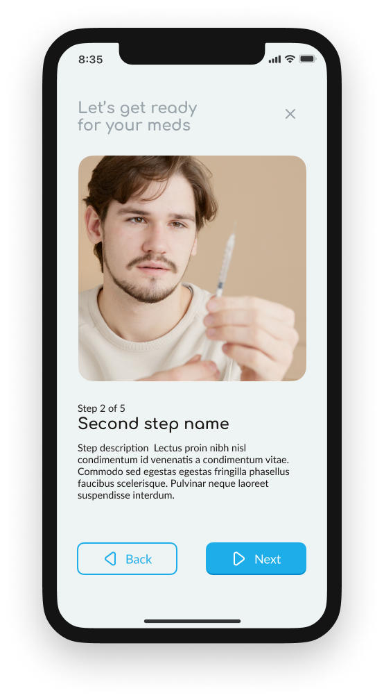
Setup Instructional Screen
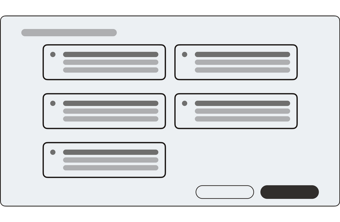
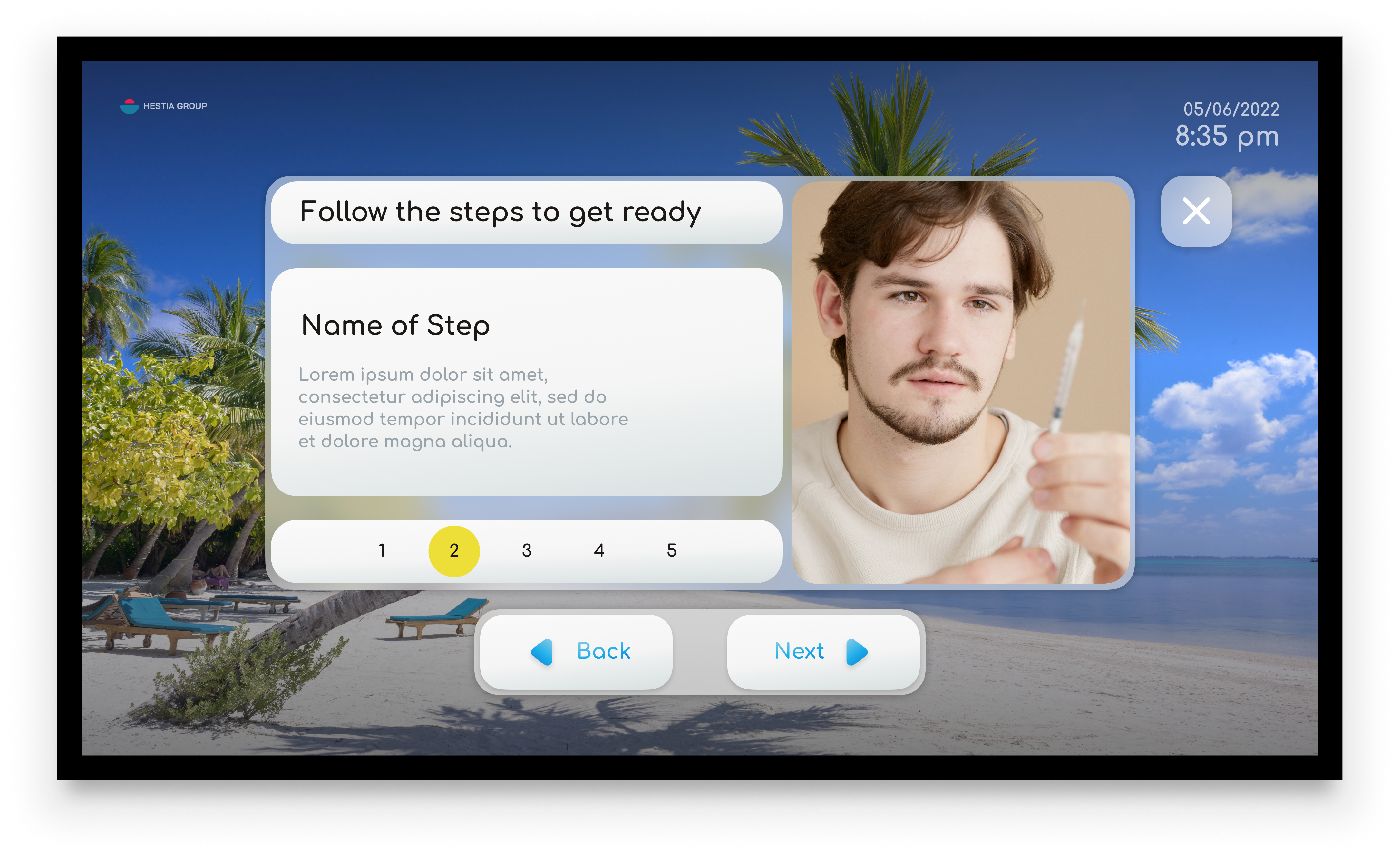
3 options for an instructional flows on TV OS
We developed 3 options for the instructional screens. Each option approached the flow of the step-by-step instructions differently. We developed each option to test how much of the next and previous steps we would want to indicate. Based on their previous research with patients, we found that it was best to show the name of the next and previous steps, without confusing the user with the entirety of those instructions. Ultimately, we landed on a hybrid of two wireframes.
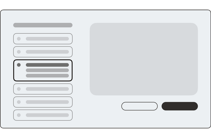
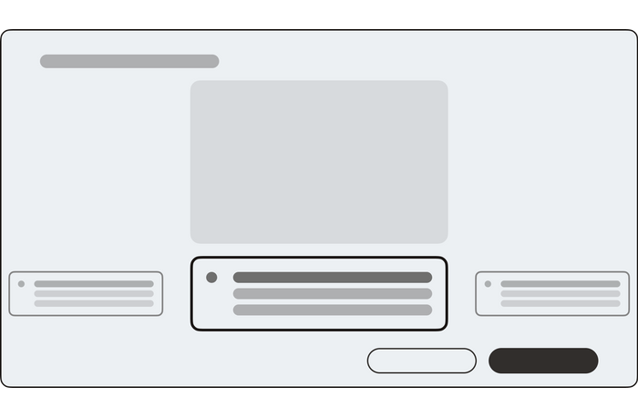
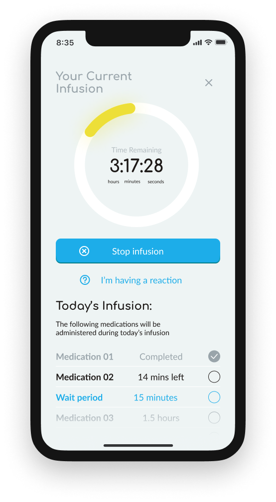
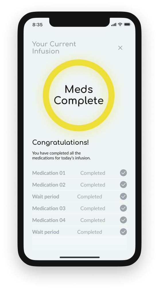
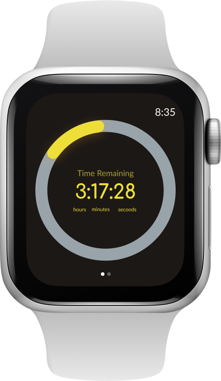
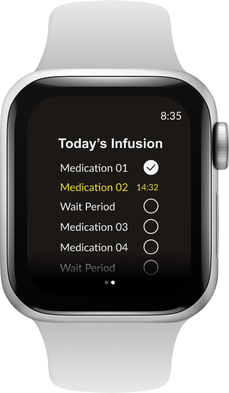
Monitor Screen
 Monitor screen wireframes
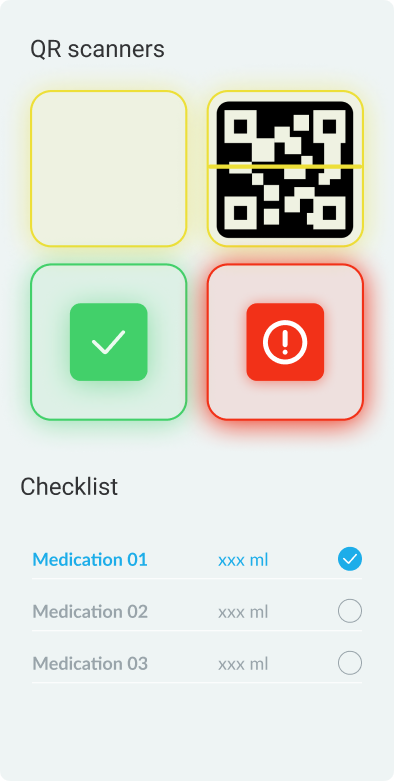
After a patient has assembled the device and prepared their medications, they are taken to a screen that will help them monitor the progress of their infusion. This screen also provides help if the patient is having an allergic reaction. We surmised that key information required for this screen would need to be the name of the medication provided, how much the medication would take to complete, what medications would be provided next, and how much time the total process would take. We proposed to put this information in a dynamic checklist, such that each medication would get a check mark.
Key insights from developing wireframes:
-
Too much information will confuse patients. Too little information will not be sufficient to complete a task.
-
Patients need complete information about their current task, and only limited information about their next task.
- Layouts for the same screens on TV and mobile devices should be similar enough that users can easily handoff a process from one device to another.
High-resolution designs
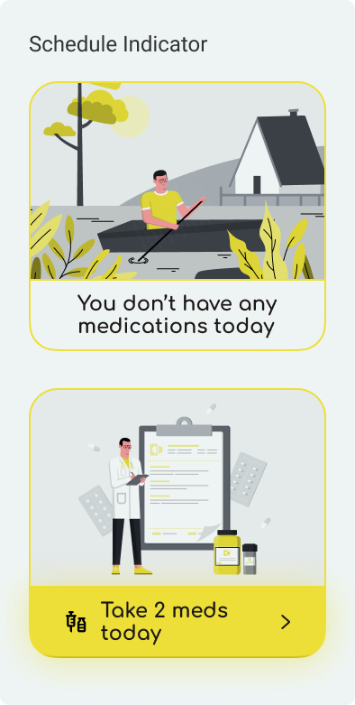
Home Screen
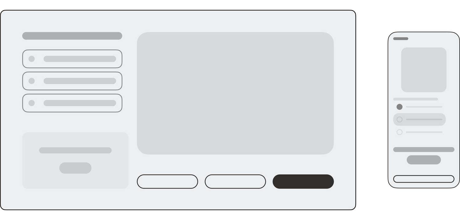
We developed a home screen that would serve as a dashboard for users and help inform them about when their next infusion would be. The home screen offers a large indicator that turns into a bright yellow button on infusion days. That button will take users to a flow that will walk users through the process of setting up their infusion device. On the bottom of the screen, a blue scan button launches a QR scanner that is used to confirm incoming medications.

Home screen on TV and mobile
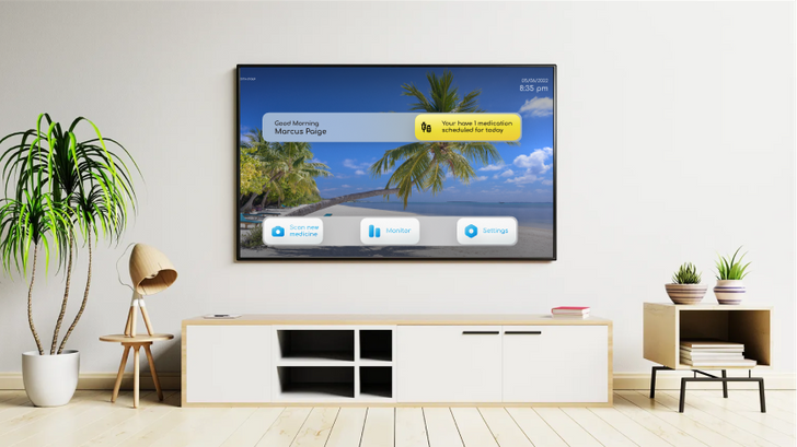
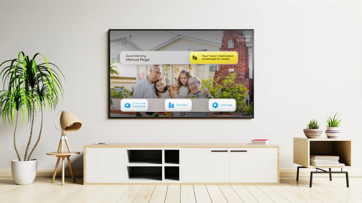
Custom homescreen wallpapers
The Home screen of the TV app can be customized to show a personal photo as the background. This process not only transforms the aesthetic of the home screen, but also provides patients with a way to personalize the app.
Scan in new medications
When the user receive new medications, they use the QR scanning screen to confirm that they received the correct medication in the right dosage. Patients use their mobile device to scan each QR code, and as they do, the app automatically adds the medication to a checklist. When the user has scanned all of the medications in a particular shipment, the app informs them how to safely store the medication until the scheduled infusion date.
If a patient scans a medication that has the incorrect dosage or type of medication, the app displays a bright red indicator, and the app informs the user not to use this medication, and contact their medical provider to correct the error.
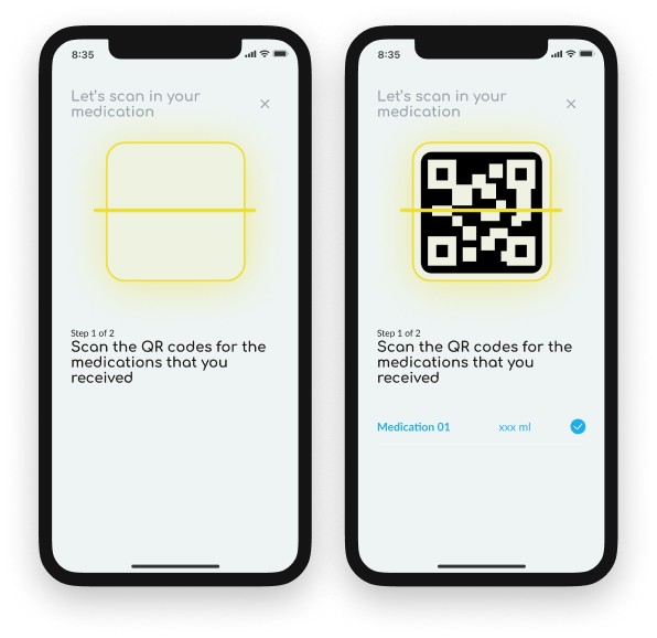 Mobile QR scan screens
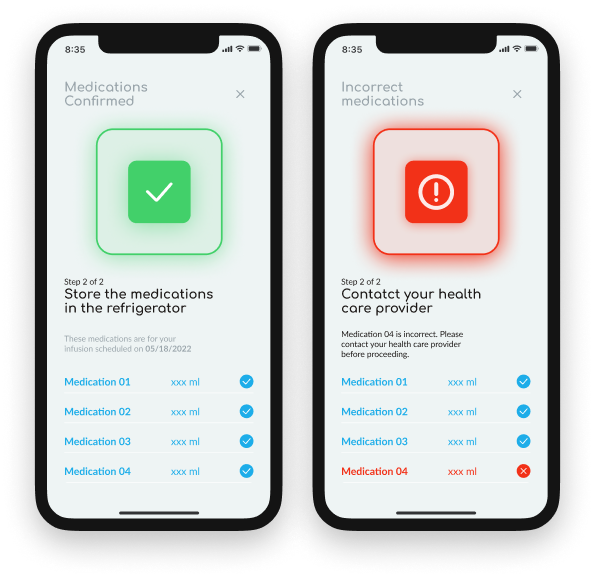 Mobile scan confirmation screens
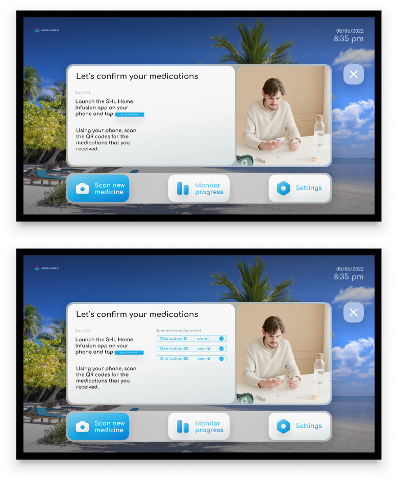 TV version of the Scan-in Screens
If users prefer to read text on their TV screens, they can open the TV app during the scanning process and follow on screen instructions there.

TV version of the scan-in confirmation
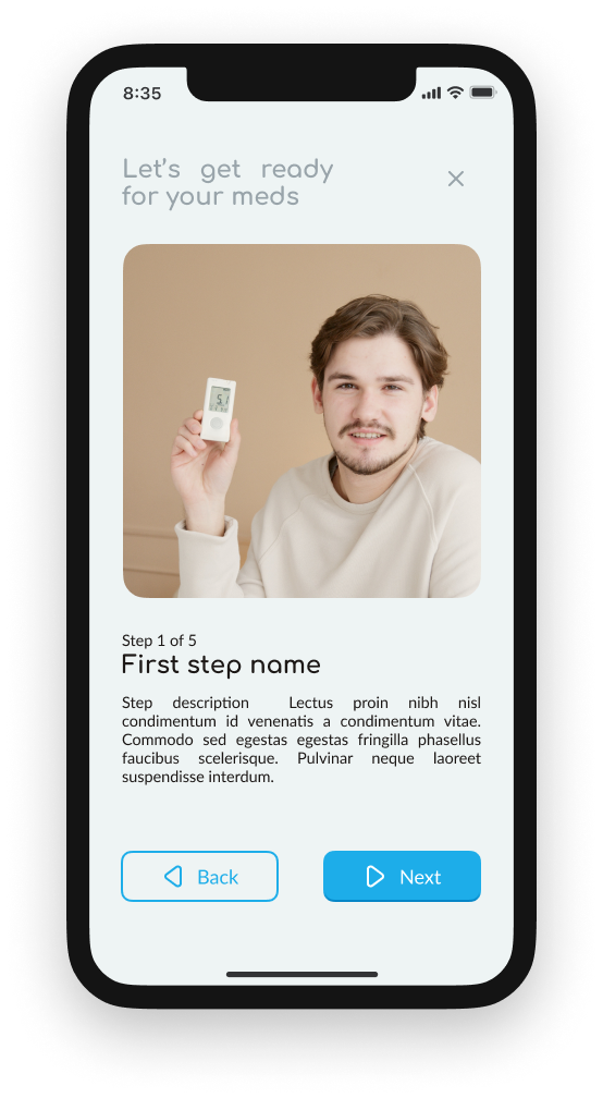
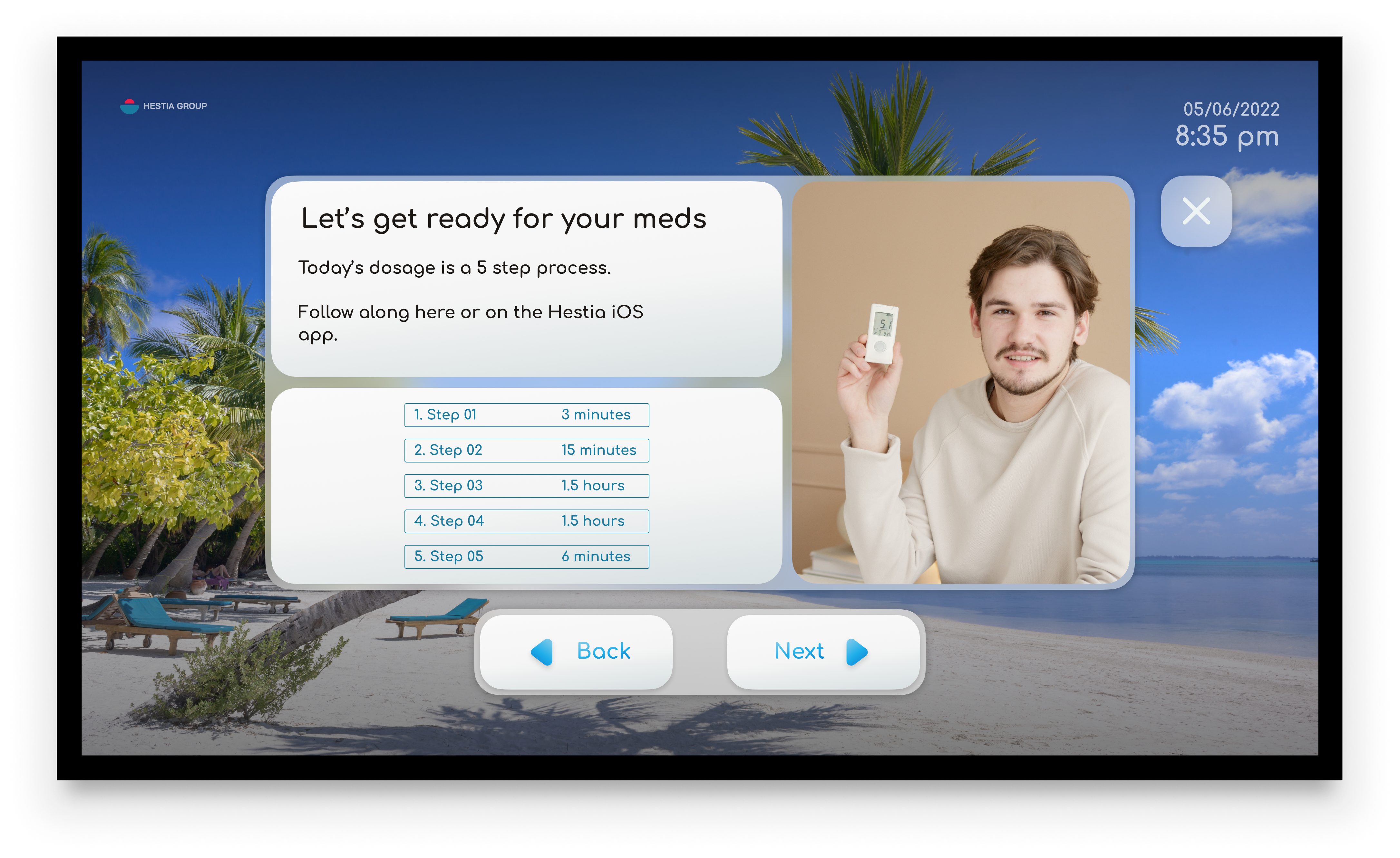
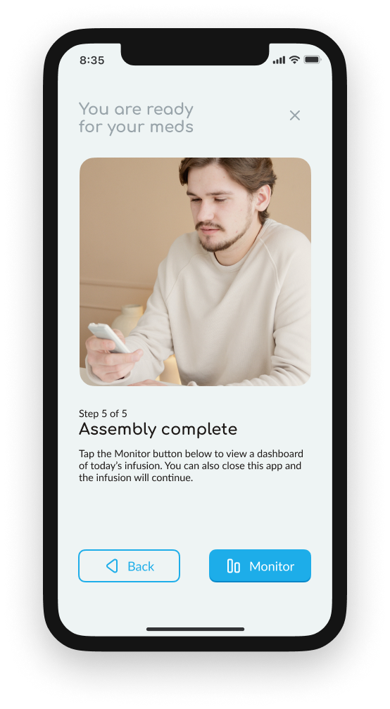
Setup instructional flow
On the day of a scheduled infusion, users use the yellow home screen button to launch the setup instructional flow. This flow walks users through the set up of their infusion device. Again, users can seamlessly pass between TV and mobile instructions. Each step is illustrated by instructional photos along with textual directions. Users can flip forward and back between steps if they need to, and both the TV and mobile app show users what step they are on in the process.

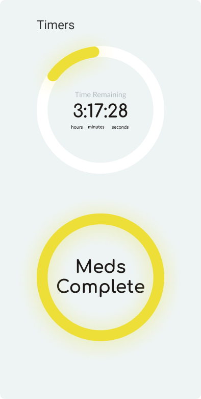
Monitoring an infusion
During an infusion, patients can monitor and control the process from the Monitor screen. The screen provides a large clear timer ring that shows progress for the entire process. If a patient is having an allergic reaction or needs to stop the infusion for any reason, they can do so easily from either the mobile or TV app. If they would like, they can also install an Apple watch app to follow along.
This screen was specifically designed to require minimum input from the patient. If they are using the TV app, they can change to a different app at any time without disturbing the process. This way, during long infusions, patients can use their TVs to stream video or any other media they would like.
 Monitor screen for TV
 Key insights from developing a high-resolution mockup
- Key information should appear when it is needed and recede when it is not needed.
- CTAs should provide a clear description of their function
- Graphics should provide intuitive representations of information
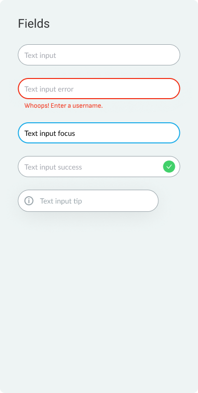
Design System
Style Guide
Style guide for TV and mobile
A design system built for comfort
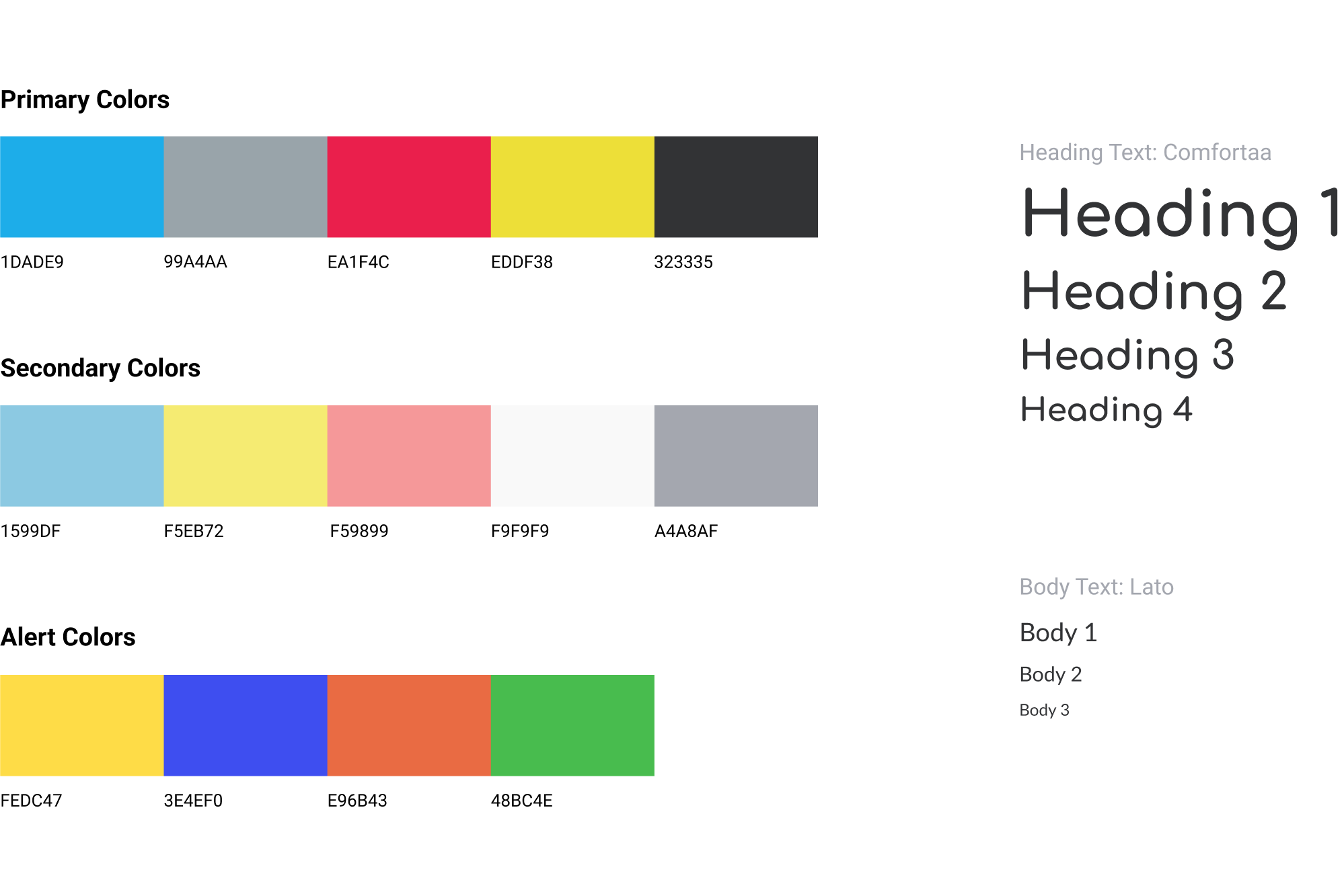
When providing medical care to a patient, a provider should evoke comfort, confidence, professionalism, and calm. The primary and secondary colors that make up the majority of this app’s visual ecosystem were selected to invoke these feelings in users. The UI utilizes a largely pale blue background with high-contrast blue and yellow buttons. The color palette was designed to facilitate a comforting and gentle environment that would be accessible to all users and provide them with a sense of calm and comfort during what could be an uncomfortable medical process.
The font, Comfortaa, was selected because of its softness and gentle aesthetic. The round quality of the font helps reinforce notions of comfort and gentleness.
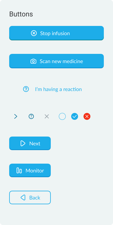
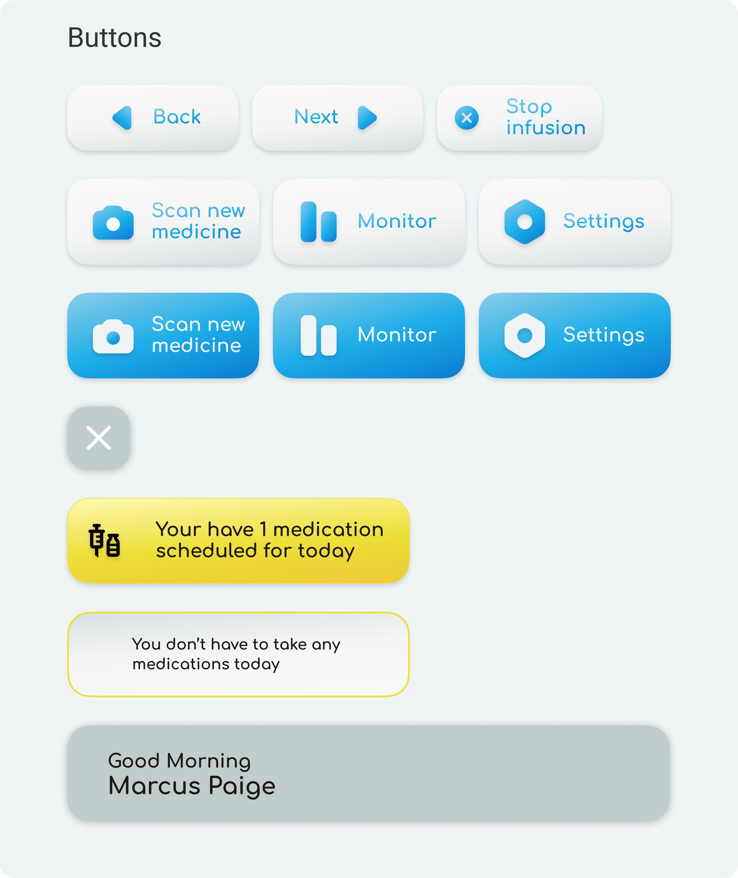
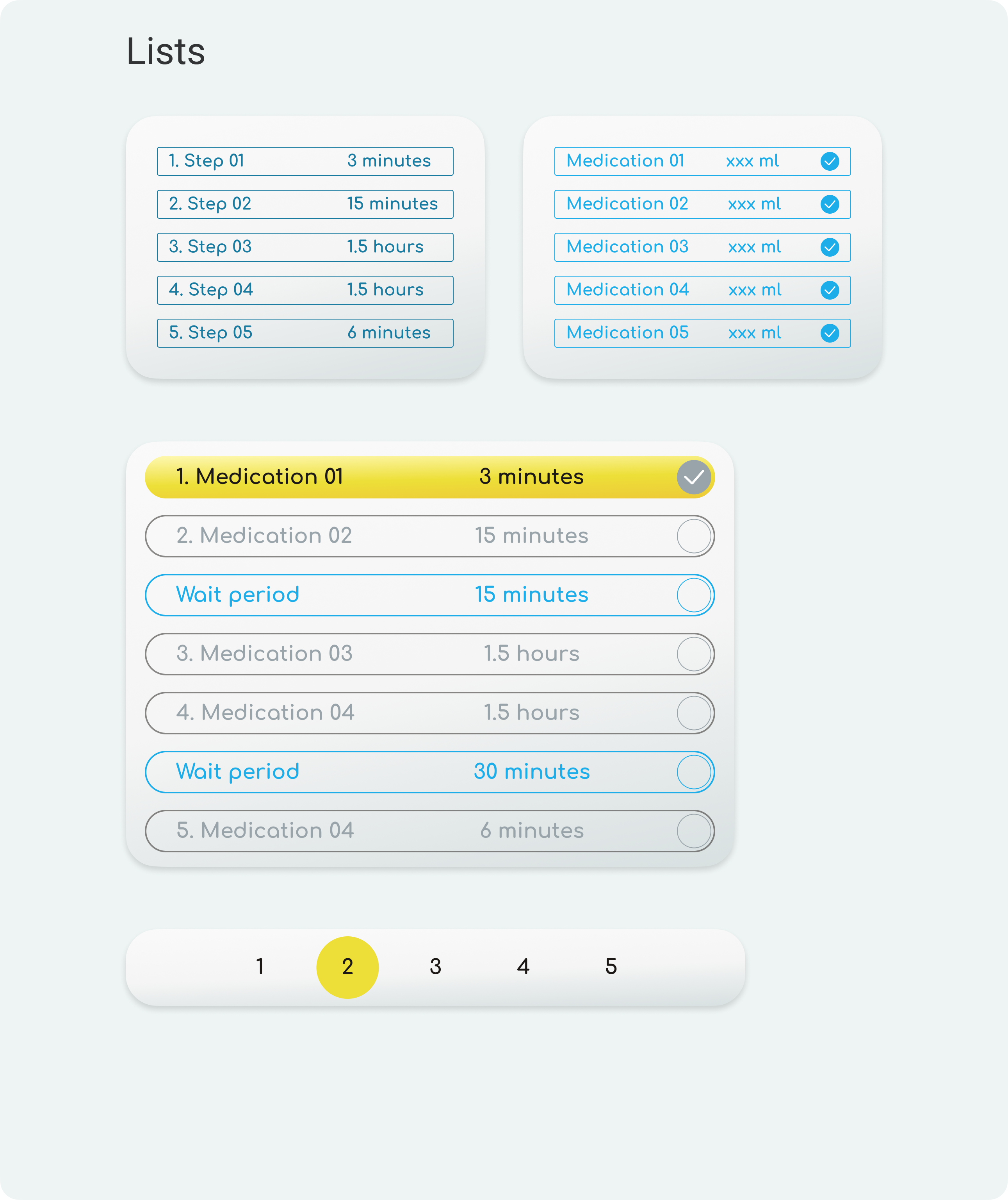
Gentle, Friendly Components
The graphical components of the UI were designed to maximize legibility and passively educate users about their functionality. Buttons are bright, gentle, and rounded. UI elements like check lists do double duty, providing users with background information if tapped. The timer graphic was derived from the shape of a clock.